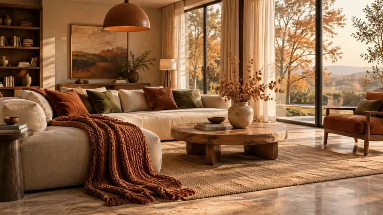
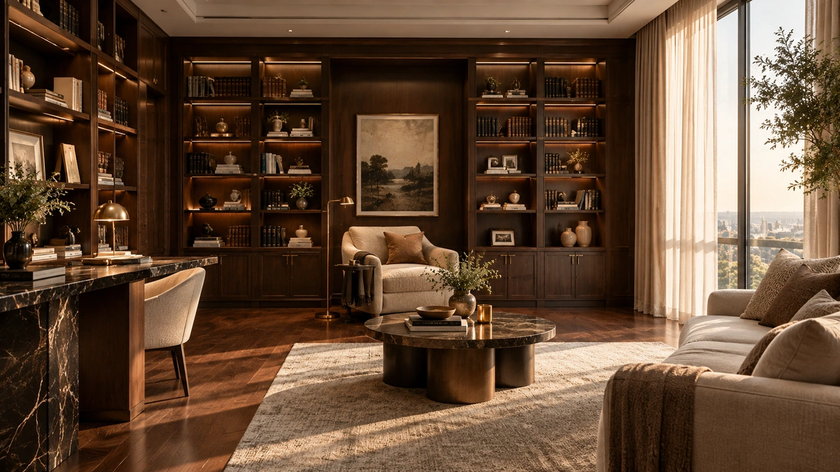
A bookshelf is far more than a simple storage solution; it is a blank canvas that reflects your personal narrative and design sensibility. When styled with intention, these units become the focal point of a room, bridging the gap between functional organization and sophisticated interior design. Yet, finding the balance between an overflowing collection and a curated display is a common challenge for many homeowners.
Achieving a polished look often feels elusive, especially when you are trying to integrate personal treasures alongside your library. Without a clear strategy, shelves can quickly transition from organized to cluttered, disrupting the visual harmony of your home. Professional styling is less about perfection and more about creating a rhythm that guides the eye and elevates the surrounding space.
Whether you are working with expansive built-ins or a modest standalone unit, the right approach can transform your storage into a refined gallery of your favorite things. By mastering a few fundamental techniques, you can turn any shelf into an intentional design statement. Read on to explore these sophisticated bookshelf ideas and discover how to curate a home library that feels both personal and impeccably styled.
Mastering the Rule of Thirds for Balanced Displays
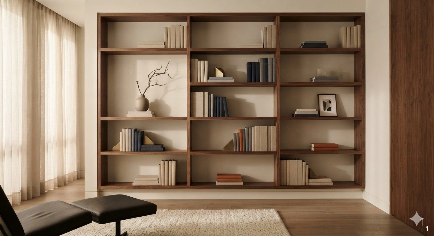
The secret to a curated bookshelf lies in the rule of thirds. By mentally dividing your shelf into three equal sections, you can create a dynamic arrangement that feels intentional rather than haphazard. Avoid lining up books in a monotonous, single-file row. Instead, group objects in odd numbers—threes or fives work best—to create visual tension and interest. Try placing a stack of books horizontally to act as a pedestal for a small object, then balance it with a taller vertical stack on the opposite side.
This approach works best in living rooms where shelves serve as both storage and display. It prevents the ‘library fatigue’ that happens when every inch is packed with spines. Use this technique on open shelving units where you can easily reach the back of the shelf to adjust your groupings. When styling, mix your hardcovers with soft textures like linen-bound volumes to add depth. A common mistake is placing items too close to the edges of the shelf; leave a slight buffer to allow the eye to rest. By varying the height and orientation of your books, you create a landscape that invites the viewer to linger and explore each individual vignette.
Color-Coded Shelving for Visual Impact
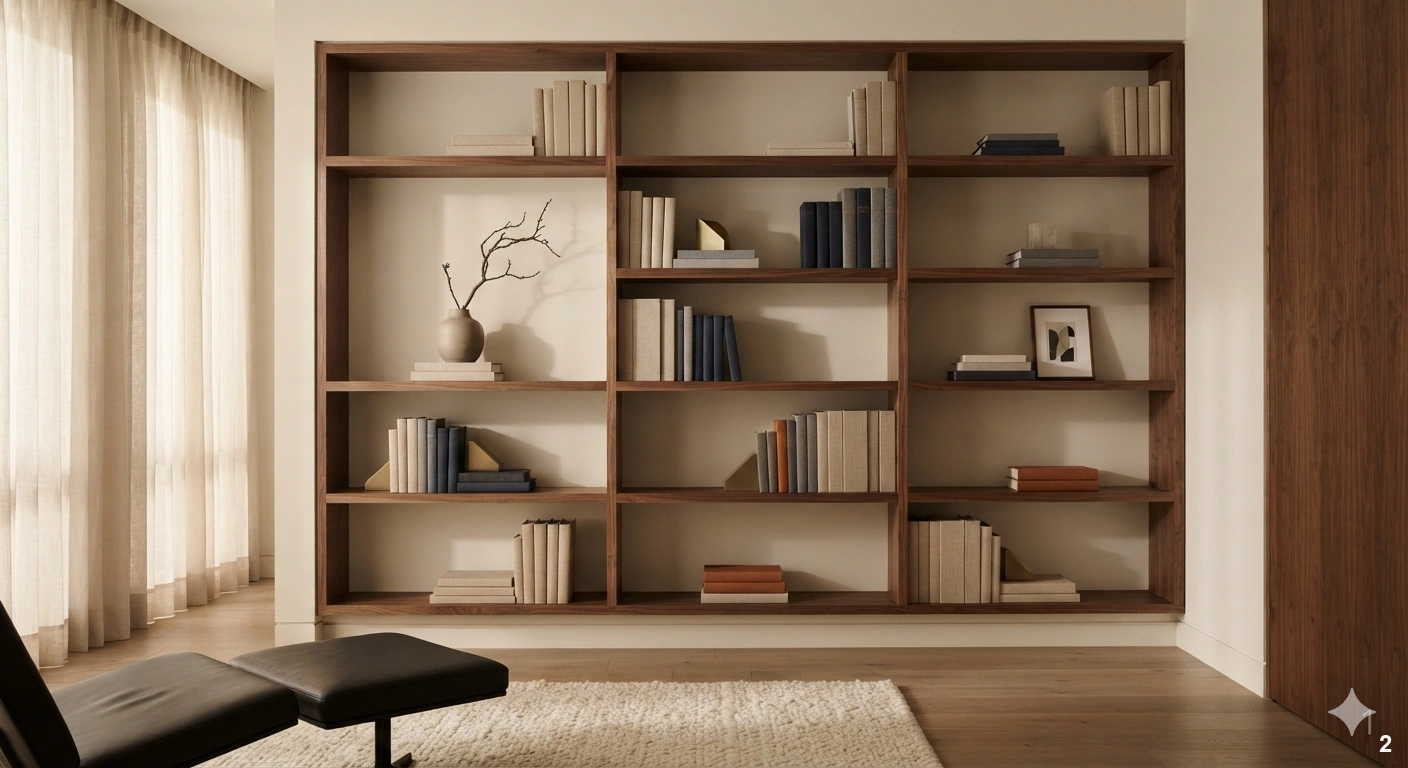
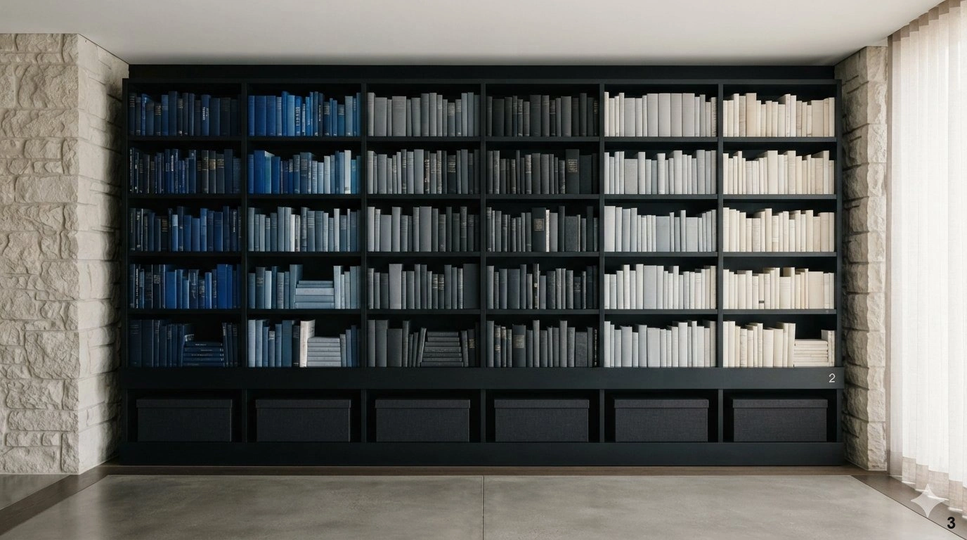
Color-coding is a bold design choice that turns a functional bookshelf into a vibrant, artistic feature. While some prefer a strictly monochromatic look, organizing by color spectrum creates an immediate sense of order and high-end sophistication. This method works exceptionally well in home offices or bright, airy reading nooks where you want the shelving to act as the primary pop of color against neutral walls. To keep it from looking like a children’s playroom, focus on muted, tonal transitions—such as moving from deep navy and slate to soft grays and creams.
If you have a large collection, consider grouping books by similar hues rather than a strict rainbow. This adds a sense of rhythm and flow to the room. For an elevated touch, incorporate decorative boxes or baskets in complementary shades to hide unsightly office supplies or tech cables. A frequent mistake is failing to account for the dust that gathers on spines; ensure your shelves are easily accessible for cleaning. If your books have busy, mismatched jackets, consider removing them to reveal the clean linen or cloth covers beneath for a more cohesive, monochromatic aesthetic. When the lighting is soft and warm, these color transitions become a stunning backdrop that anchors the entire space.
Integrating Sculptural Art Pieces Among Books
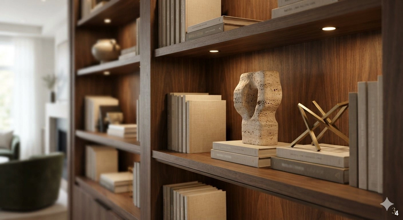
A bookshelf should be more than a home for literature; it is a gallery for your personal collection. Integrating sculptural art pieces among your books breaks up the monotony of rectangular spines and introduces essential personality. Choose objects with varying silhouettes—think organic stone shapes, geometric brass forms, or hand-thrown ceramics—to provide contrast against the linear nature of books. This strategy is perfect for built-in shelving units in a formal living room, where you want to signal that the space is curated and lived-in.
The trick is to allow these objects to breathe. Give each piece enough ‘air’ around it so that it commands attention. If you have a deep shelf, place a smaller sculpture in the foreground and a larger, taller piece toward the back to create layers. This adds a sense of architectural depth. Avoid overcrowding the shelf with too many knick-knacks, as this quickly leads to visual clutter. Instead, select three or four high-quality pieces that share a common material palette, such as warm wood or polished marble, to tie the display to the rest of the room’s decor. Proper lighting, such as a directional picture light or subtle recessed spots, will highlight the texture of these art pieces, turning your library into a sophisticated museum-quality display.
Strategic Use of Negative Space to Prevent Clutter
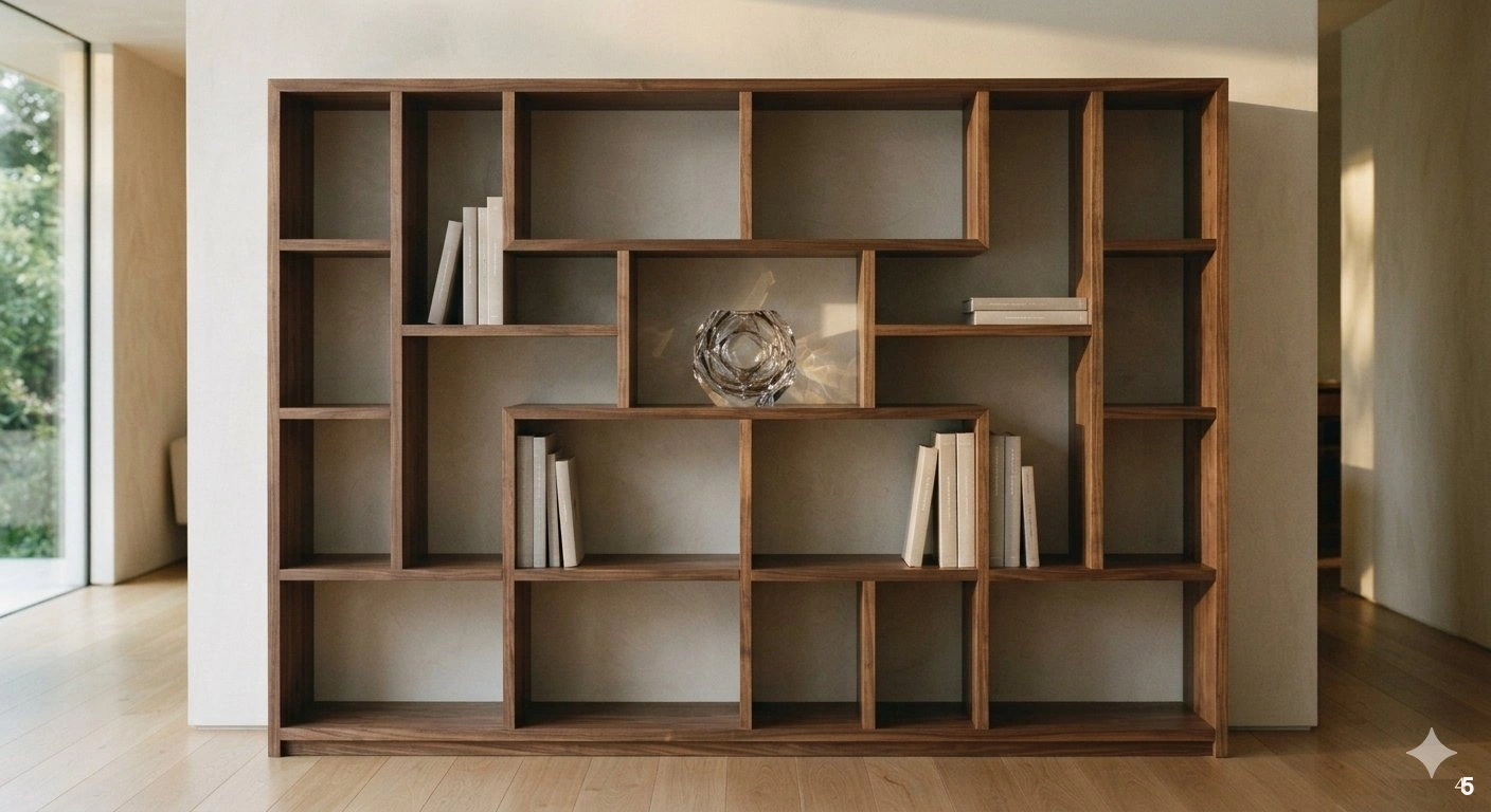
Negative space is the most powerful tool in a designer’s arsenal, yet it is the most frequently overlooked. In the context of bookshelves, negative space refers to the empty areas where you choose not to place anything at all. Leaving sections of your shelf bare allows the eye to rest and prevents the space from feeling overwhelmed. This approach is essential in smaller rooms or apartments where a floor-to-ceiling bookshelf could otherwise dominate and shrink the perceived square footage of the space.
To implement this, try leaving every third shelf entirely empty, or leave large gaps between groupings of books. This creates a sense of intentionality and luxury—it signals that you have curated your collection rather than simply filling a void. Use negative space to frame a single, significant item, like a piece of art or a unique glass vessel. This makes that item feel like a prized possession. A common mistake is filling every corner with small, insignificant trinkets; remember that less is almost always more. When you embrace the blank space, you allow the architecture of the bookshelf itself to shine. Pair this with a clean, neutral paint color on the back of the shelves to enhance the sense of volume and lightness in the room.
Professional Lighting Techniques for Dramatic Shelving
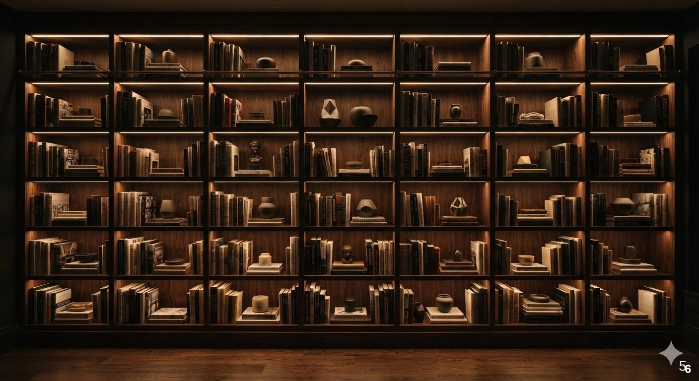
Lighting is the difference between a standard storage unit and a custom-designed display. Without proper illumination, even the most beautiful collection of books can look dark and uninviting. The most effective approach is to install integrated LED strip lighting hidden behind the front edge of each shelf. This provides a soft, warm glow that grazes the spines of your books and highlights the texture of your decorative objects, creating a dramatic, museum-like effect in the evening.
For a more traditional look, consider installing small, adjustable picture lights above the bookshelf unit. This is particularly effective if your shelves house art prints or framed photographs alongside your books. When choosing your lighting, always opt for a warm color temperature—around 2700K to 3000K—to keep the atmosphere cozy and inviting. Avoid cold, blue-toned lights, which can make a home look sterile and clinical. A common mistake is using harsh, direct spotlights that create glare on glossy book covers or glass accessories. Instead, aim for diffused, indirect light that washes over the surfaces. If retrofitting your shelves with electrical wiring isn’t feasible, high-quality rechargeable, motion-sensor LED bars can offer a similar aesthetic impact without the need for an electrician. This professional touch transforms your shelving into a central focal point that adds warmth and character to any room.
Maximizing Verticality with Floor-to-Ceiling Built-ins
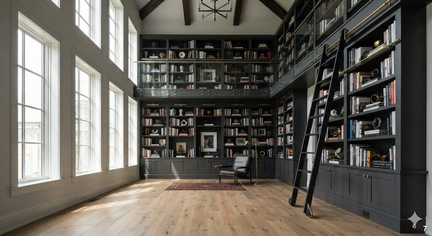
Floor-to-ceiling bookshelves are the ultimate statement in luxury interior design. By drawing the eye upward, these units emphasize the height of your ceilings and make even a moderately sized room feel grand and expansive. This is the ideal solution for homeowners looking to create a dedicated home library or a sophisticated study. When designing these units, ensure the carpentry feels integrated into the architecture of the room; crown molding or baseboards that match the existing trim make the shelves look like a permanent, timeless fixture.
For the most polished look, keep the shelving unit the same color as the walls. This creates a seamless, monochromatic effect that feels incredibly high-end. If you want to add a bit of drama, paint the back of the shelves a shade darker than the walls to add depth and make your books pop. A frequent mistake is failing to account for the weight of books; ensure your shelves are made of high-quality, thick wood or reinforced materials that won’t sag over time. For the highest shelves that are difficult to reach, use this space to store less-frequently accessed items or large, oversized art books that serve more as decor. To reach the top, consider a rolling library ladder in a metal finish like bronze or matte black, which adds a functional yet undeniably elegant architectural detail to the space.
Minimalist Floating Shelf Arrangements
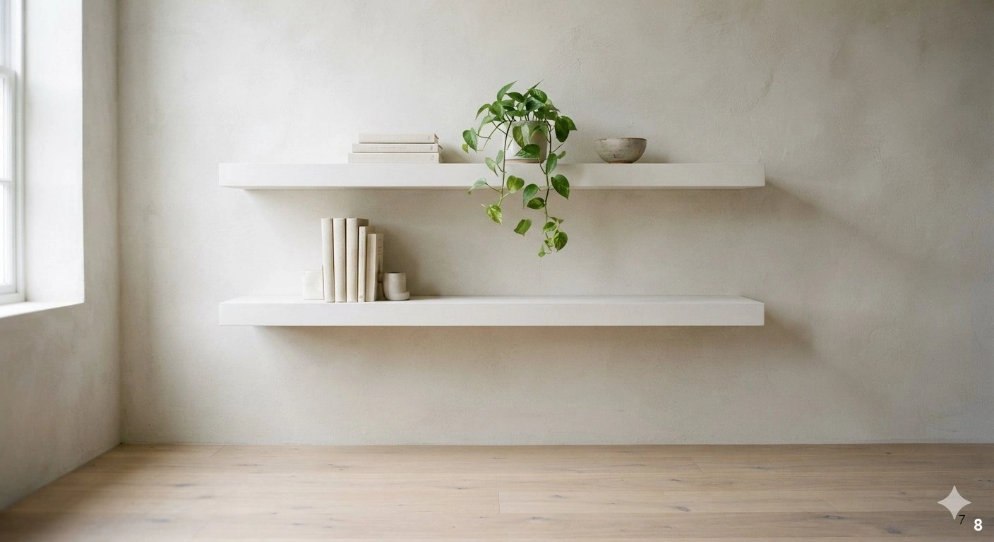
Floating shelves offer a clean, modern aesthetic that is perfect for those who prefer a light, unburdened look. Because they lack visible brackets or heavy frames, they appear to hover against the wall, making them ideal for small living spaces or minimalist home offices. To master this look, keep the number of shelves to a minimum—two or three long, staggered shelves often look more impactful than a dense grid of shorter ones. This approach works best on a focal wall, perhaps flanking a fireplace or centered above a console table.
When styling floating shelves, consistency is key. Since there is no surrounding cabinet to ‘contain’ the mess, your selection of items must be highly curated. Use a limited color palette for your books and accessories—think shades of white, cream, and wood tones—to maintain a cohesive, tranquil vibe. A common mistake is overloading the shelves with too many heavy items, which can make the wall look unbalanced or cluttered. Instead, focus on a mix of one or two leaning books, a single trailing plant like a pothos, and a sculptural ceramic bowl. The beauty of floating shelves lies in their ability to be changed frequently; they are the perfect canvas for rotating your collection based on the season or your current mood. Ensure they are securely mounted to the wall studs, especially if you plan to display heavy art books or stone sculptures.
Incorporating Natural Textures and Organic Elements
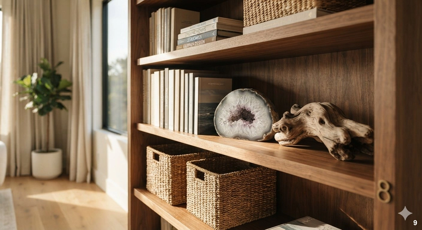
To soften the rigid lines of a bookshelf, it is essential to incorporate natural textures and organic elements. Bookshelves can often feel cold or overly structured, but introducing items like woven baskets, raw wood, or stone accents brings a necessary warmth and earthiness to the display. Baskets, in particular, are a designer’s favorite for solving the storage dilemma; they hide clutter like remote controls, cords, or loose papers while adding a beautiful, tactile texture to the shelf.
Consider adding organic shapes to your shelves, such as a piece of driftwood, a large geode, or a bowl of smooth river stones. These items provide a beautiful contrast to the manufactured, uniform shape of book covers. Place these items on lower or middle shelves where their texture can be appreciated up close. When choosing materials, look for natural fibers like rattan, seagrass, or linen to balance out the harder surfaces of metal or glass decor. A common mistake is ignoring the ‘vibe’ of the room; if you have a modern space, choose sleek, polished stone; if your home is more rustic or bohemian, opt for raw, unfinished wood and textured ceramics. By layering these organic elements alongside your books, you create a shelf that feels approachable, grounded, and deeply connected to the natural world. This layering technique is exactly what gives high-end designer homes their characteristic ‘collected’ and soulful feel.
9. Refining the Look with Decorative Bookends
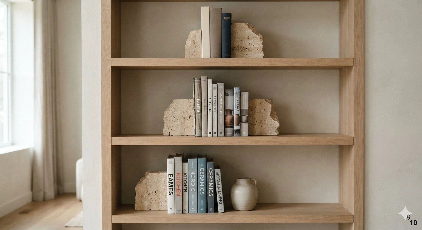
Bookends are the jewelry of your shelving display. They provide the necessary tension to keep volumes upright while introducing a sculptural element that elevates a standard row of books. In a refined interior, I prefer using materials with significant heft, such as solid brass, honed marble, or raw travertine, to ground the collection visually.
These pieces work best on open shelving where the eye naturally travels to the ends of the stacks. If your shelves are long, use bookends to create ‘zones’ of interest rather than letting a single row of books span the entire length. This creates visual breaks that prevent the display from feeling like a static library archive.
A common mistake is choosing bookends that are too light; if they shift when you remove a book, they lose their utility. Always opt for weighted options that feel substantial to the touch. For a sophisticated look, pair dark, patinated bronze bookends against light-colored wood shelves to create a high-contrast focal point. If your aesthetic leans more minimal, consider geometric stone forms that act as quiet, architectural statements. Remember, the goal is to frame your literature, not crowd it, so let the negative space between your bookends breathe.
10. Creating Cohesion with Uniform Binding Styles
If your library feels chaotic, the quickest route to a polished look is color-coding or binding uniformity. While some purists argue for alphabetical organization, a visual designer knows that color and texture hold more weight in a room’s overall composition. When you group books by color or spine material—such as all cloth-bound or leather-bound editions—you transform a collection of disparate items into a singular design element.
This technique works best in formal living rooms or studies where you want the shelving to feel intentional rather than utilitarian. If you have a eclectic mix of paperbacks, consider removing the dust jackets to reveal the neutral cloth underneath, or curate specific collections that share a similar tonal palette. This creates a serene, monochromatic backdrop that allows other decor pieces to shine.
Avoid the mistake of making the shelves look ‘too perfect’ or robotic. Introduce a few horizontal stacks of books to break up the vertical rhythm. This adds a layer of relaxed sophistication. For lighting, ensure your shelves are equipped with subtle, warm-toned LED strips tucked under the front edge. This highlights the textures of the bindings and adds an inviting glow that makes the space feel like a private, high-end club. It is the ultimate way to turn a functional storage unit into a bespoke feature wall.
11. Styling Deep Shelves with Layered Depth
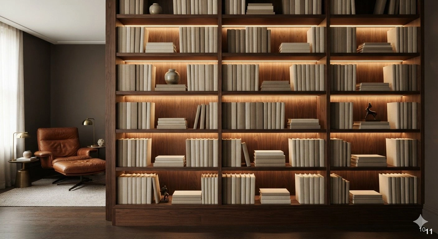
Deep shelves are often the most challenging to style because they invite clutter. To avoid the ‘black hole’ effect, you must utilize layering. Think of your shelf like a stage: place larger, taller art pieces or books at the back, and smaller, decorative objects like brass bowls, small sculptures, or glass vessels in the foreground. This creates a sense of perspective and depth.
This approach works exceptionally well in built-in cabinetry where the depth exceeds twelve inches. By pulling items forward, you prevent them from being lost in the shadows. The key is to curate objects that vary in height and scale, ensuring that the shelf doesn’t look like a flat line of items. Always leave at least thirty percent of your shelf space empty to provide visual relief.
When choosing materials for these layers, aim for variety. Mix the matte finish of ceramic vases with the reflective surface of polished nickel or glass. If the shelf remains dark, use a metallic or light-toned object at the back to bounce light forward. Avoid the temptation to fill every inch of depth; instead, focus on creating ‘vignettes’ that tell a story. A single, well-placed object on a shelf can often be more powerful than a dozen small trinkets. By treating the shelf as a layered landscape, you create an inviting, professional look that feels deeply personal.
12. Using Bookshelves as Functional Room Dividers
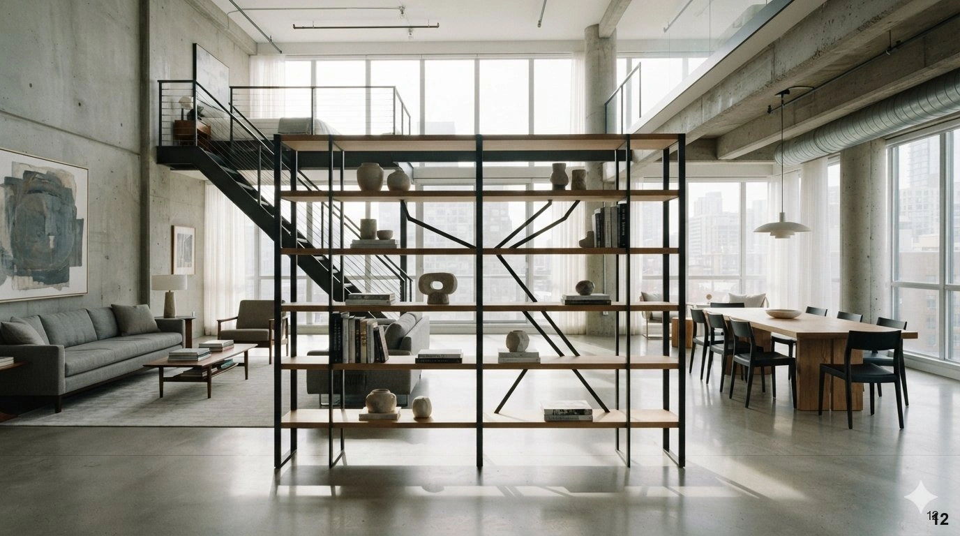
A double-sided or open-backed bookshelf is an ingenious way to delineate zones in an open-plan home without sacrificing light or airiness. By using a bookshelf as a room divider, you maintain the flow of the floor plan while creating a cozy, defined nook for reading or working. The key here is to keep the shelves styled from both sides, ensuring that no matter your vantage point, the display remains curated.
This design works best in loft-style apartments or large living spaces where you need to separate a dining area from a lounge. Because the unit is visible from multiple angles, avoid heavy, solid-backed pieces. Opt for open, airy frames in iron or light wood that allow the eye to travel through. This keeps the space feeling expansive rather than partitioned.
Styling a double-sided shelf requires a balanced approach. Use items that look good from both the front and the back. Avoid placing fragile items that could easily be knocked over in high-traffic areas. Instead, use sturdy, sculptural objects or books that feel grounded. For lighting, consider a floor lamp placed at the end of the unit to wash light across the shelves from the side. This emphasizes the architectural lines of the piece and adds depth to the transition between your living spaces. It is a sophisticated way to manage space while showcasing your personal collection.
13. Modern Home Office Library Design Concepts
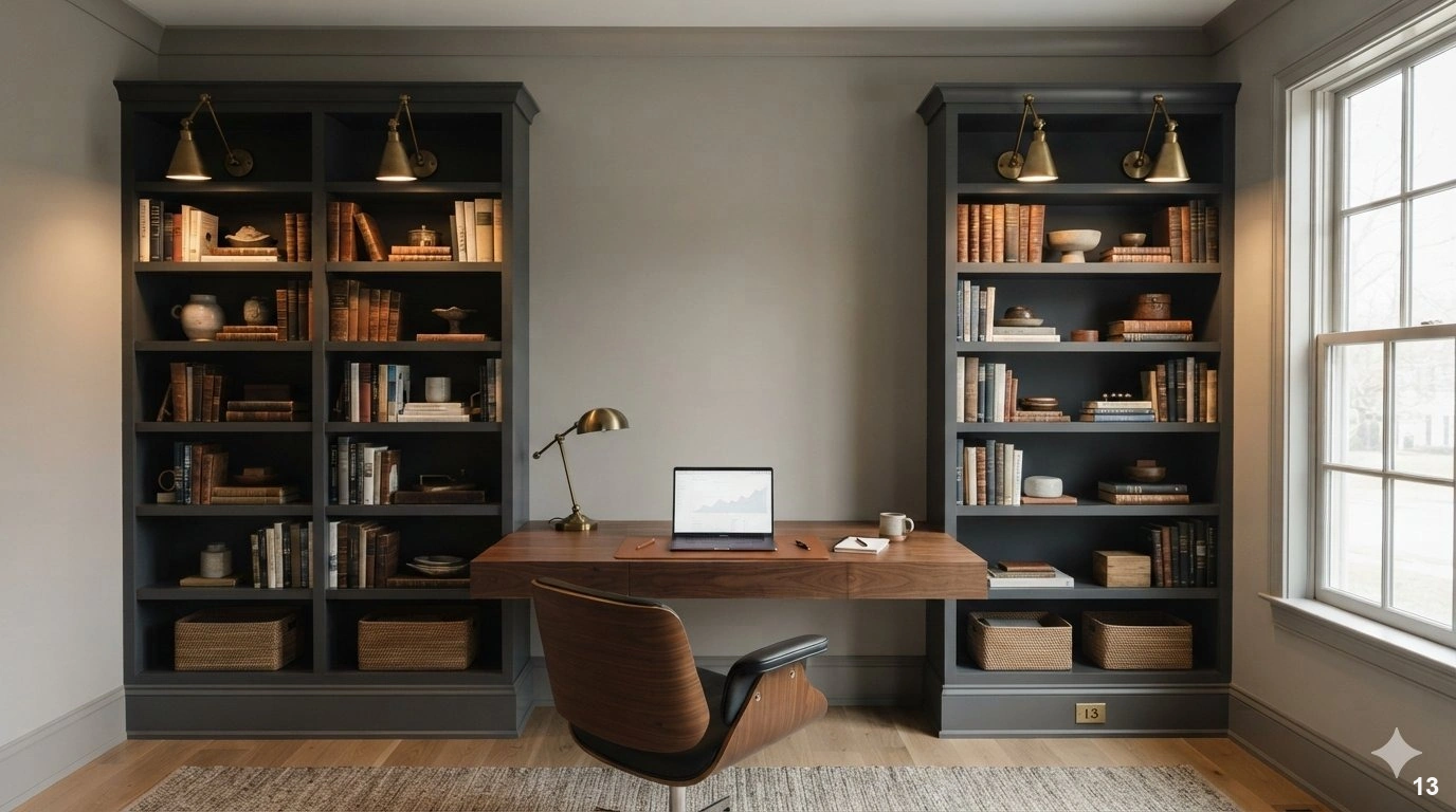
In a modern home office, the bookshelf should be more than just a place to store files; it should be a source of inspiration. To achieve a high-end look, integrate your library with your workspace by using floor-to-ceiling shelving that frames the desk. This creates a ‘command center’ aesthetic that feels both professional and intellectually stimulating.
This design works best when the shelves are integrated into the architecture of the room, perhaps painted the same color as the walls for a seamless, monochromatic look. This ‘color-drenching’ technique makes a small office feel expansive and sophisticated. When filling the shelves, prioritize professional reference books mixed with curated personal items like vintage globes, leather-bound journals, or framed awards.
A common mistake is allowing tech clutter to bleed into the library space. Use hidden storage bins or woven baskets on the lower shelves to corral cords, chargers, and miscellaneous office supplies. This keeps the upper, visible shelves reserved for items that bring joy and focus. For lighting, consider library-style sconces mounted directly onto the shelving unit. This provides task-specific illumination that highlights the spines of your books while adding a classic, scholarly charm to the room. By combining utility with refined aesthetics, you create an environment that encourages productivity and deep work.
14. Balancing Hardcover Books with Soft Textiles
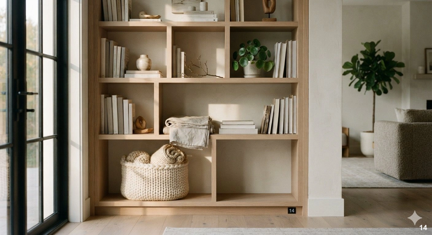
The secret to a shelf that feels warm and approachable is the introduction of soft elements. Hardcover books, while beautiful, can feel rigid and cold. By weaving in textiles—such as a small, folded linen throw, a textured wool basket, or even a decorative fabric-covered box—you immediately soften the visual impact of the unit.
This styling technique works best in living rooms or bedrooms where comfort is the priority. The texture of the fabric provides a beautiful contrast to the smooth, matte surfaces of paper and wood. It makes the space feel lived-in and inviting rather than like a museum display. When choosing textiles, stick to natural fibers like linen, cotton, or mohair to maintain an organic, high-end feel.
Avoid the mistake of overstuffing the shelves with these items. Use them as accents to break up long rows of books. A small, folded throw draped over the edge of a shelf or a fabric-lined basket used to hold magazines adds a tactile dimension that invites interaction. For color, look for neutral tones that complement the bindings of your books—creams, soft grays, or muted earth tones work beautifully. This approach is particularly effective in spaces with minimalist furniture, as it adds the necessary warmth to balance clean lines. It’s an easy, low-cost way to make your shelving feel intentionally styled and deeply comfortable.
15. Curating Collections for a Sophisticated Aesthetic
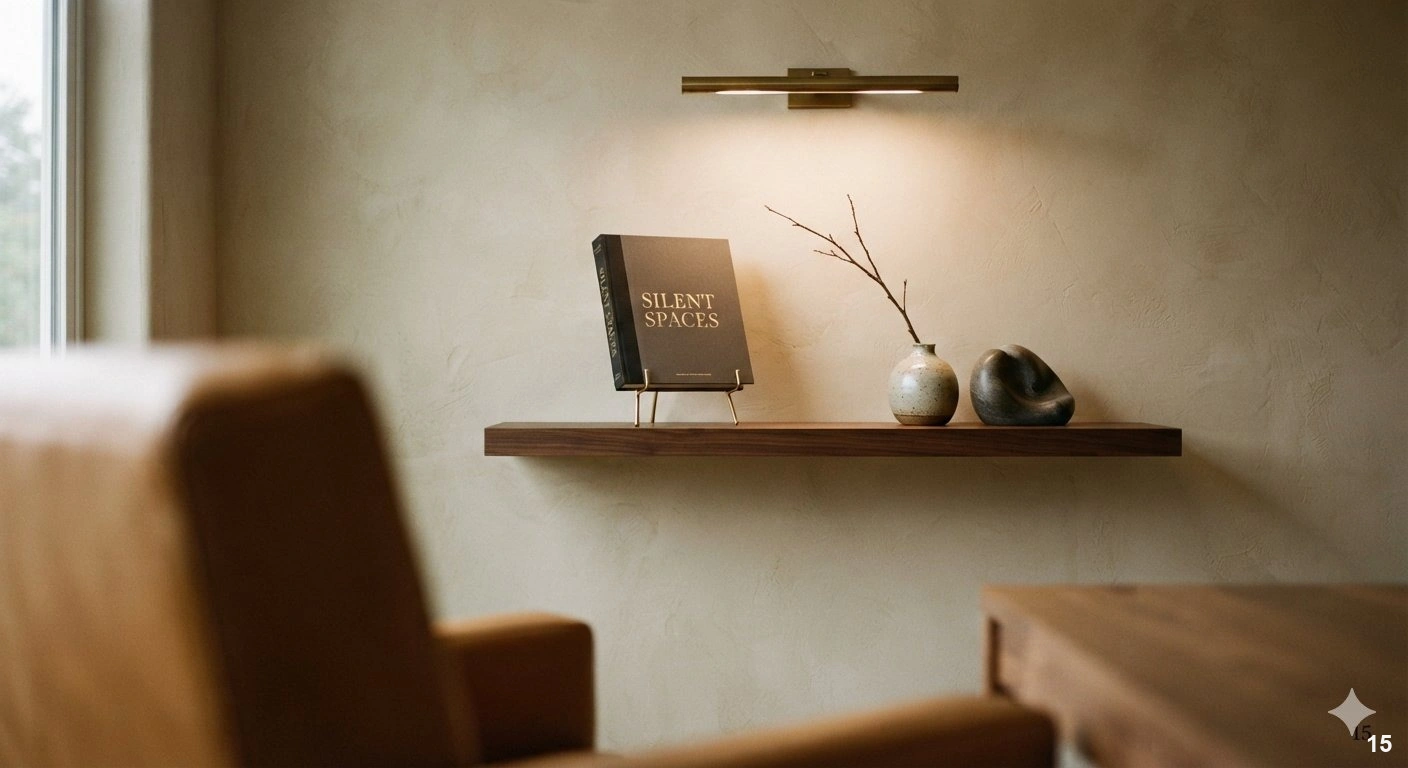
A sophisticated library isn’t about volume; it’s about curation. The most elevated shelves are those that tell a story about the owner’s interests and travels. Instead of filling every shelf to capacity, focus on creating ‘hero’ moments. Select a few prized volumes and display them face-out on a small easel or a dedicated display shelf to celebrate their cover art.
This works best in a formal study or a dedicated reading corner. By treating your books as art, you shift the focus from storage to display. Mix these volumes with meaningful collected objects—a piece of pottery from a trip, a vintage camera, or a small stone carving. This gives the shelf a personal, storied quality that is impossible to replicate with mass-market decor.
Avoid the trap of ‘filler’ decor. Every item on the shelf should have a purpose or a place in your narrative. If an object doesn’t resonate with you, remove it. The negative space is just as important as the items themselves; it allows the eye to rest and prevents the display from feeling cluttered. For lighting, use a soft, warm directional spotlight or a picture light above the display area to highlight your curated collection. This creates a dramatic, gallery-like effect that elevates the entire room. Remember, a curated shelf is a reflection of your personality—keep it authentic, keep it sparse, and let your best pieces speak for themselves.
16. The Impact of Back-Panel Wallpaper in Shelving
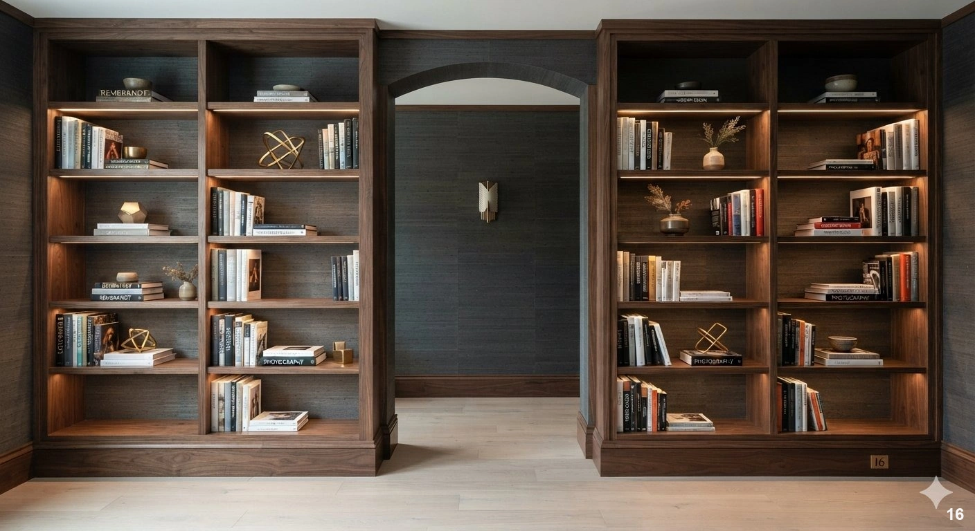
If your shelving feels flat or uninspired, the back panel is your greatest canvas. Applying wallpaper to the back of a bookshelf is a transformative design trick that adds depth, color, and texture to an otherwise simple unit. Whether you choose a subtle grasscloth for organic texture or a muted geometric pattern for visual interest, it turns the shelf into a sophisticated backdrop for your belongings.
This works best on open, fixed shelving where the back wall is clearly visible. For a high-end look, choose a paper that complements the room’s existing color palette but adds a layer of refinement. A deep, moody charcoal grasscloth, for instance, can make light-colored books pop, while a metallic-flecked paper can add a touch of glamour to a dark study.
When choosing wallpaper, consider the scale of the pattern. A large-scale print can look overwhelming, so opt for smaller, repeating patterns that enhance rather than compete with the items on display. Avoid the mistake of using a pattern that is too busy; remember that the wallpaper is meant to be a supporting player, not the star. If you are renting or prefer a temporary change, peel-and-stick wallpaper is a fantastic, high-quality solution that provides the same aesthetic impact without a permanent commitment. Pair this with warm, internal shelf lighting to make the texture of the wallpaper truly shine. It is the ultimate designer secret for turning standard shelves into custom-made, high-impact features.
17. Rotating Seasonal Decor for Dynamic Interiors
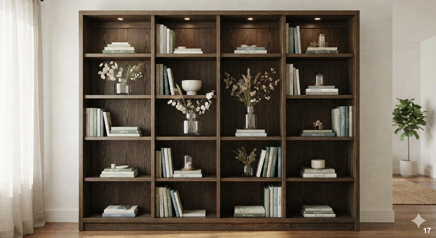
Your bookshelf should be a living, breathing component of your home that evolves with the rhythms of the year. Instead of static displays, treat your shelves as a gallery space that welcomes subtle shifts in mood. When you rotate accessories alongside your collection, the entire room feels refreshed without requiring a full redesign.
In the cooler months, introduce warmth through brass objects, rich velvet book spines, or heavy ceramic vessels in deep, earthy tones. As spring arrives, swap these for lighter elements like translucent glass, dried botanical stems, or decorative coral. This approach keeps your shelving from feeling stagnant and prevents the accumulation of dust-collecting knick-knacks that lack purpose.
A common mistake is over-stuffing shelves during these transitions. Keep the curation tight—if you add a seasonal piece, remove a decorative object of equal size to maintain visual breathing room. For lighting, consider adding slim, battery-operated LED puck lights at the top of select cubbies to highlight your current seasonal vignette, casting soft shadows that emphasize texture. Remember, the goal is not to fill every inch, but to create a curated snapshot that reflects the current spirit of your home. By keeping your base collection of books constant, you provide a stable foundation that allows these smaller decorative updates to shine.
18. Utilizing Symmetry for Traditional Elegance
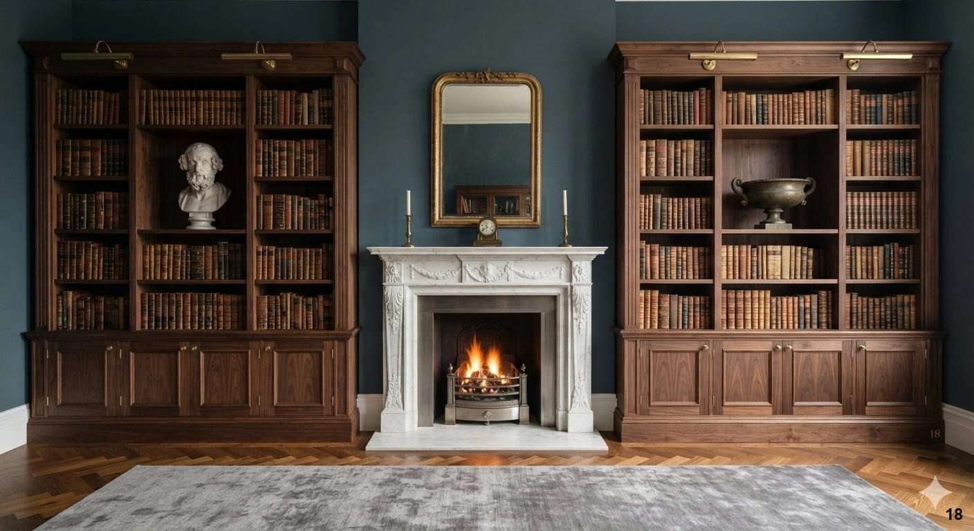
There is an inherent sense of calm that comes with perfect symmetry. In formal spaces like libraries or living rooms, mirroring your shelving arrangements creates a grounding effect that feels polished and intentional. This technique works best when you have a pair of identical bookcases flanking a fireplace, a window, or a large piece of art.
To execute this successfully, start by placing your largest, most substantial items in the same position on both sides. If you place a heavy stack of art books on the bottom left shelf, replicate that weight on the bottom right. Avoid the temptation to make it identical to the point of rigidity; instead, focus on balanced ‘visual weight.’ If you have a ceramic bust on one side, perhaps a sculptural bowl of similar volume balances it on the other.
Material choices are vital here. Dark stained woods or classic white built-ins provide the best backdrop for symmetrical styling. Avoid mixing too many disparate colors; sticking to a monochromatic or complementary color story ensures the eye focuses on the order and composition rather than a chaotic array of spines. When lighting these units, use integrated picture lights or recessed downlights above each section to ensure the symmetry is visible even after dusk. The result is a timeless, sophisticated look that exudes luxury and deliberate design. Steer clear of overcrowding the edges, as negative space is what allows the symmetrical arrangement to breathe and maintain its refined, architectural appeal.
19. Mixing Horizontal Stacks with Vertical Rows
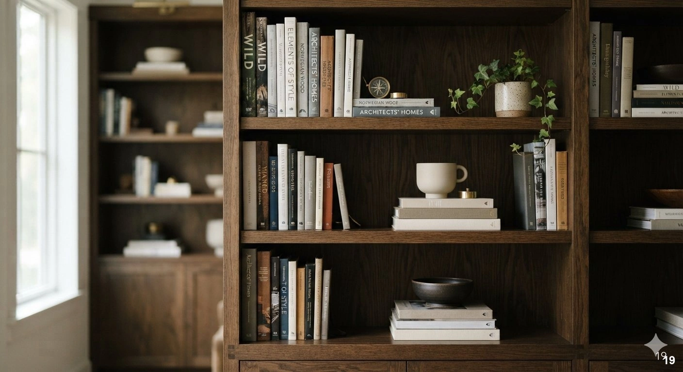
The secret to a professional-looking shelf lies in the interplay between vertical rows and horizontal stacks. If every book stands upright in a rigid line, the shelf can feel like a library catalog rather than a designer vignette. By introducing stacks of books placed horizontally, you create natural ‘shelves within shelves’ that allow you to display decorative objects at varying heights.
Horizontal stacks serve as excellent pedestals for sculptural items, small framed photos, or a single, striking piece of pottery. This technique works best in larger, open-plan living areas where you want the shelving to act as a focal point. It breaks up the monotony of the spines and draws the eye to different levels, encouraging the viewer to linger on individual pieces.
When styling, aim for a ratio of about one horizontal stack for every three vertical sections. This keeps the look intentional rather than messy. Ensure that your stacks are stable and never stacked so high that they touch the shelf above, which can create a claustrophobic feel. Use this method to group books by color or genre, using the stacks as visual anchors for your color palette. If you are struggling with a shelf that looks too flat, this is the most effective way to add depth and dimension. Always finish by tucking a small plant or a brass paperweight onto the top book of your stack to unify the display. This subtle shift transforms a functional storage unit into a sophisticated, multi-layered design element.
20. Small-Space Solutions for Urban Apartment Living
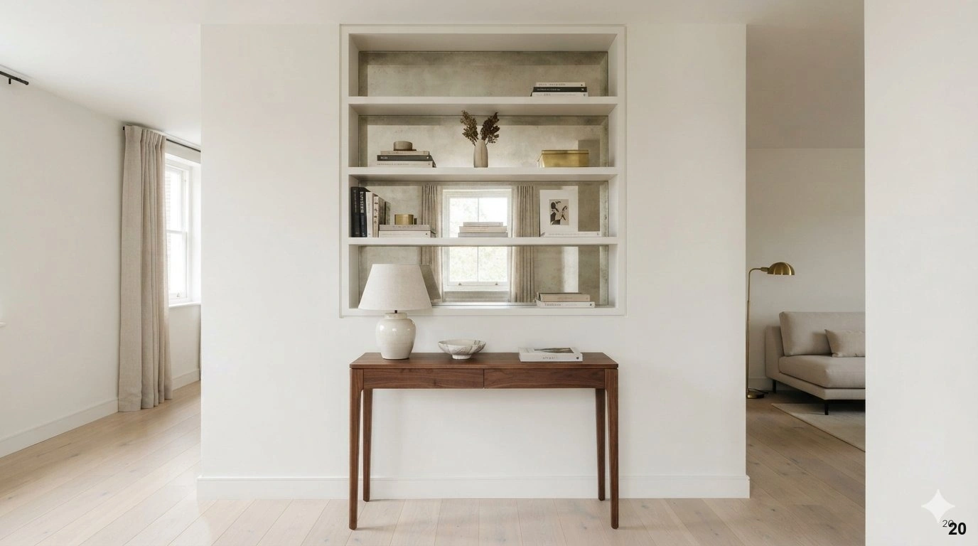
In an urban apartment, every square inch is precious. When floor space is at a premium, look to the vertical plane. Floor-to-ceiling shelving is a game-changer; it draws the eye upward, making the ceiling feel higher and the room more expansive. By utilizing the entire wall, you gain significant storage without sacrificing precious floor real estate.
Consider floating shelves for a minimalist approach. These offer a clean, airy aesthetic that doesn’t overwhelm a compact room. For the best result, mount them in alcoves or above furniture like a console or desk. If you are worried about the ‘clutter factor,’ choose shelves in the same color as your wall to make them disappear into the architecture, letting your curated collection become the artwork.
Another designer trick for small spaces is the use of mirrored backings on your shelves. This reflects light and creates an illusion of depth, effectively doubling the volume of the space. When styling, be hyper-selective. In a small home, less is truly more. Focus on high-quality items—a few well-placed books, a single piece of statement art, and perhaps one functional item like a decorative box for remote controls. Avoid mixing too many textures or loud patterns, which can make a small room feel chaotic. Instead, stick to a cohesive, light-reflecting palette. By keeping the shelves organized and uncluttered, you transform a necessary storage solution into a beautiful, intentional feature that respects the scale of your home.
21. Choosing Between Freestanding and Custom Built-in Units
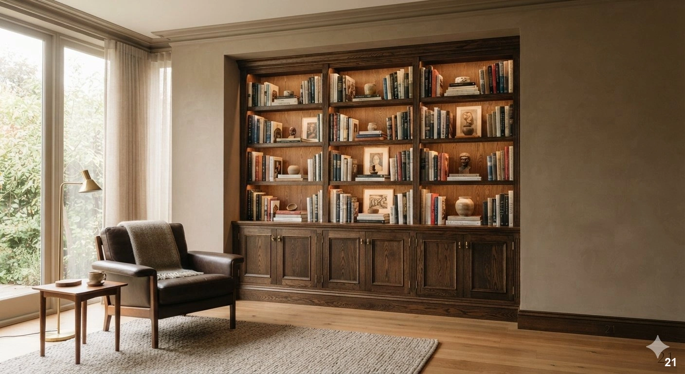
The choice between freestanding bookcases and custom built-ins often comes down to the architecture of your home and your long-term vision. Custom built-ins are the gold standard for a polished, seamless look. They integrate directly into the structure of the room, often utilizing awkward corners or wall niches that would otherwise be wasted. This is ideal for homeowners who want to add architectural value and a permanent sense of luxury to their space.
Freestanding units, however, offer unmatched flexibility. They are the perfect choice for those who enjoy rearranging their space or for renters who need a solution that can move with them. A high-quality freestanding bookcase, perhaps in a rich walnut or matte black metal, can serve as a sculptural statement piece in its own right. It acts as an anchor for the room’s design story.
When selecting a freestanding unit, prioritize quality materials. Solid wood or heavy-gauge metal will stand the test of time and provide the stability needed for a substantial book collection. Avoid cheap, thin particleboard, which can sag under the weight of books over time. If you opt for built-ins, consider adding decorative molding or custom cabinetry at the base to hide unsightly electronics or extra supplies. This creates a ‘library’ feel that is both functional and aesthetically elevated. Regardless of your choice, ensure your shelving is anchored to the wall for safety. A well-placed piece of furniture should feel like it belongs, whether it is built-in or carefully curated as a standalone masterpiece.
22. Selecting a Consistent Color Palette for Shelf Decor
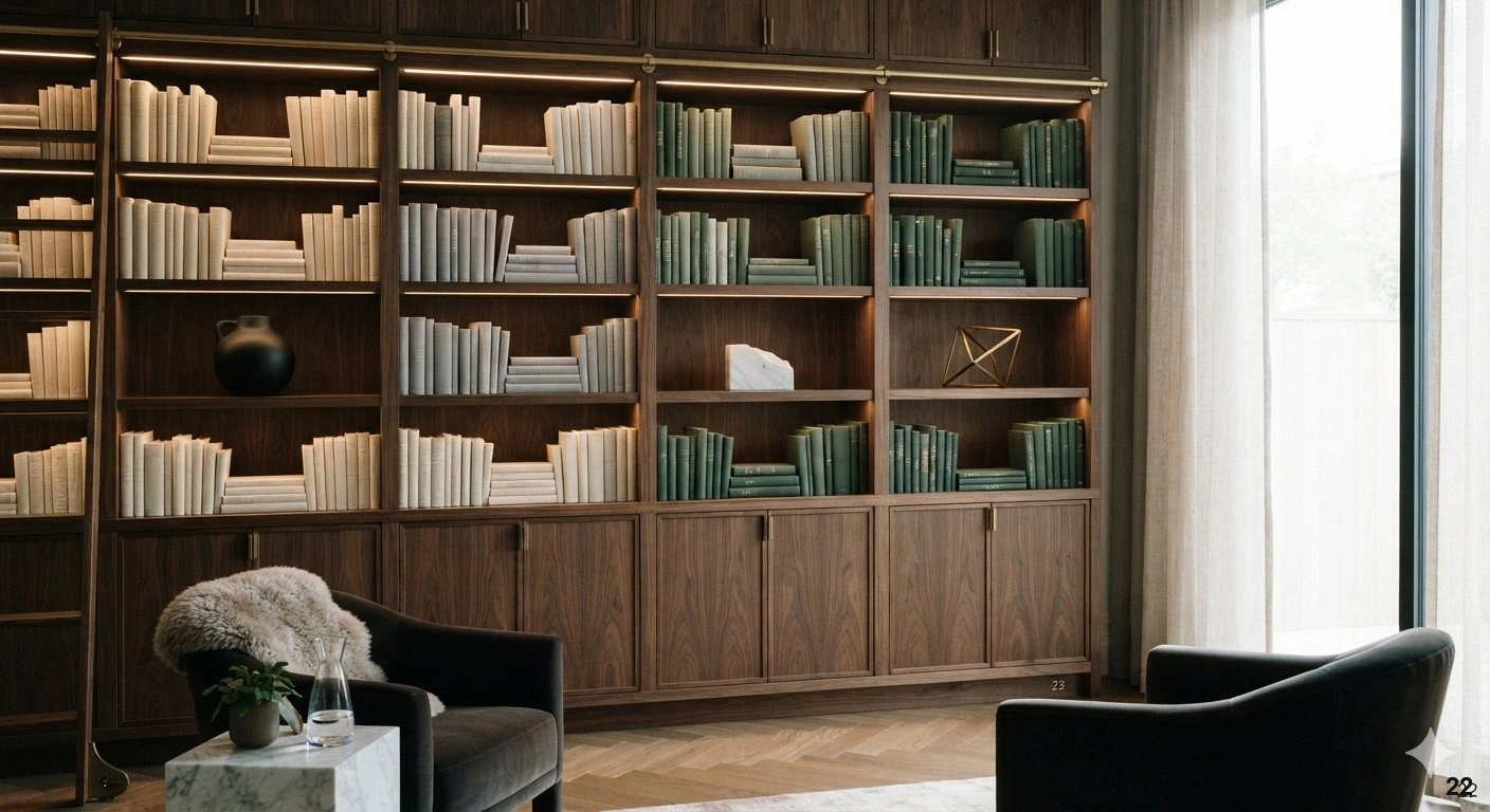
A curated shelf is often defined by its restraint. If your books are a riot of colors, the easiest way to achieve a sophisticated look is to group them by color or spine tone. This creates a cohesive visual flow that prevents the shelves from feeling like a chaotic jumble. Once you have established this base, you can layer in decorative items that complement or contrast that specific palette.
If you prefer a more neutral, serene environment, consider turning books around so the pages face outward. This creates a uniform, textural look that is incredibly calming and works beautifully in bedrooms or minimalist living areas. You can then punctuate these neutral tones with sculptural objects in matte black, warm brass, or organic stone.
When choosing your decorative objects, stick to a ‘three-color rule.’ Select a primary metal, a secondary material (like wood or ceramic), and an accent color. For instance, a palette of brass, white marble, and deep forest green creates a high-end, timeless feel. By limiting your color story, you ensure that even if you have many items, the shelf reads as one unified design statement rather than a collection of unrelated objects. Avoid the mistake of adding too many ‘loud’ colors that compete with your books. Your shelves should support the room’s existing palette, not fight against it. Use lighting to highlight the colors you have chosen; a warm-toned under-shelf light will make brass accents glow and soften the edges of your book collection, adding an extra layer of luxury to the final composition.
Frequently Asked Questions
How do I prevent my bookshelves from looking cluttered if I have a large collection?
The secret to managing a large collection lies in the strategic use of negative space. Avoid filling every inch of every shelf; instead, leave periodic gaps to allow the eye to rest. You can also group similar items—such as books of the same height or color—to create a sense of order. By interspersing your books with sculptural objects or decorative accents, you break up the monotony of dense rows, transforming a storage-heavy unit into a curated, breathable display that feels intentional rather than overwhelming.
Should I organize my books by color or by subject?
Both methods have merit, but the choice depends on your design goals. Organizing by subject is highly functional, making it easier to locate specific titles, while color-coding creates a striking visual impact that can anchor a room’s color palette. For a sophisticated compromise, try grouping by color within subject categories, or use color-coding only on specific sections of the shelving. Ultimately, the best approach is one that aligns with your lifestyle—if you reference your books daily, prioritize accessibility; if the shelf is primarily for display, prioritize visual harmony.
What is the best way to light a bookshelf to make it look professional?
Professional lighting adds immediate depth and drama to any shelving unit. For built-ins, integrated LED strip lighting hidden behind the front edge of each shelf is the gold standard, as it provides a soft, even glow that highlights the textures of your books and decor. If you are using freestanding units, consider installing battery-operated puck lights or placing a stylish picture light above the unit. The goal is to create a warm, inviting ambiance that draws the eye toward your most cherished collections.
How can I incorporate non-book items without making the shelves look messy?
To integrate decorative objects successfully, treat them as punctuation marks within your library. Use the ‘Rule of Thirds’ to balance objects of varying heights and textures against your book stacks. Place larger, heavier items on the bottom shelves to ground the display, and reserve eye-level shelves for your favorite sculptural pieces or art. By layering items—placing a small object in front of a slightly taller book, for example—you add depth and interest, ensuring your personality shines through without compromising the unit’s overall refined aesthetic.
Are floating shelves a good choice for a small apartment?
Floating shelves are an excellent solution for urban living because they utilize vertical wall space without the visual weight of a bulky floor unit. By leaving the floor area clear, they maintain an open, airy feel in smaller rooms. To keep them looking polished, limit the number of items per shelf and ensure your brackets are installed level and securely. They offer a minimalist, contemporary look that is perfect for displaying a curated selection of books and small decor pieces without encroaching on your living space.
Conclusion
Transforming your bookshelves from simple storage into a curated design feature is a rewarding process that brings both order and personality to your home. By applying techniques like the rule of thirds, intentional negative space, and thoughtful lighting, you can create a display that feels both sophisticated and deeply personal. Remember that a well-styled library is never finished; it is a living collection that evolves alongside your interests and aesthetic preferences.
Start by selecting just one of these concepts—perhaps refreshing your color palette or introducing a few sculptural art pieces—to see how it changes the rhythm of your room. You do not need to overhaul your entire library at once to achieve a professional, elevated look. With a bit of patience and a discerning eye, you will soon find that your bookshelves become the most captivating focal point in your home.