Have you ever meticulously curated a room, purchasing high-quality furniture and beautiful accessories, only to step back and feel like the space is still missing something? It can be deeply frustrating when a room feels sterile, cluttered, or disjointed despite your best efforts. Often, the issue is not your personal taste, but rather a few easily overlooked details in how the elements of the room interact.
Identifying these common decor-mistakes is the first step toward creating a balanced, cohesive home. Minor errors in scale, such as an undersized area rug or artwork hung just a few inches too high, can quietly disrupt the visual harmony of an entire room. Fortunately, achieving a polished, designer-level look does not require a complete overhaul or a professional budget.
By understanding a few timeless design principles, you can easily correct these imbalances using the pieces you already own. With simple formulas for lighting, proportion, and layout, you can transform any chaotic space into a curated sanctuary. Read on to discover how to diagnose these subtle styling pitfalls and implement the effortless fixes that will instantly elevate your home.
Undersized Area Rugs That Float Disconnectedly
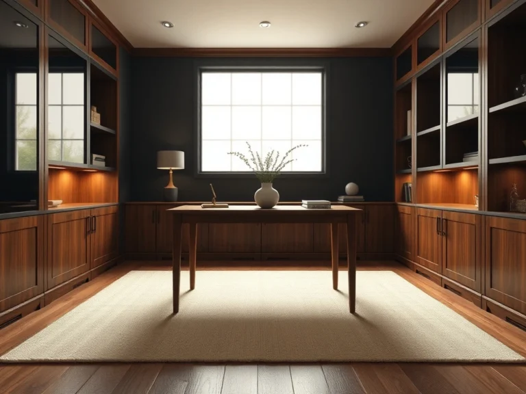
One of the most common decor-mistakes is selecting an area rug that is far too small for the room, creating an awkward ‘island’ effect where furniture floats disconnectedly. A rug acts as the anchor for a seating arrangement; when it is undersized, the entire room feels disjointed and visually shrunk. In a living room, the golden rule is that at least the front legs of all major seating pieces—sofas, accent chairs, and side tables—must rest comfortably on the rug. For dining rooms, the rug should extend at least twenty-four inches beyond the table edges so chairs remain on the rug even when pulled out.
To achieve a high-end, cohesive look, opt for natural materials like wool, jute, or sisal, which offer both durability and organic texture. If you love a smaller vintage Persian rug that doesn’t quite fit the scale of your room, try layering it over a larger, neutral sisal or flatweave base rug. This designer-approved technique adds depth, rich texture, and warmth while maintaining proper proportion. Avoid the mistake of leaving a wide strip of bare floor between your seating and the rug, which breaks the visual flow. Instead, aim for a generous scale that unifies the layout, instantly making the space feel expansive, grounded, and professionally curated.
Hanging Wall Art Above the Natural Eye-Level Standard
Hanging artwork too high is a frequent decor-mistakes pitfall that instantly disrupts a room’s sense of balance. When art is suspended near the ceiling, it loses its connection to the furniture below and forces viewers to strain their necks, breaking the cozy, intimate feel of a well-designed home. Designers rely on a simple, foolproof formula: the center of the artwork should hang at fifty-seven to sixty inches from the floor, which mimics the natural eye-level standard used in professional galleries.
When hanging art above a sofa, console, or fireplace mantel, aim for the bottom of the frame to sit roughly six to eight inches above the top of the furniture piece. This keeps the composition unified rather than disjointed. Consider the scale of the wall; a small frame on a massive blank wall looks lost, so group smaller pieces into a tight gallery wall or choose a singular, statement-making oversized canvas. Frame your pieces in high-quality materials like thin oak, matte black metal, or elegant gilded wood to elevate the aesthetic.
Ensure your lighting highlights the piece without creating harsh glare; a slim, cordless brass picture light mounted directly above the frame adds an instant layer of luxury and warmth. Avoid the common mistake of aligning the top of the frame with door frames, which pulls the gaze upward and away from the living zone.
Over-Relying on a Single Overhead Light Fixture
Relying solely on a single overhead light fixture—often referred to by designers as ‘the big light’—is one of the most critical decor-mistakes you can make. This single-source approach casts harsh shadows, flattens architectural details, and strips a room of its natural warmth and dimension. To create an inviting, high-end atmosphere, you must layer your lighting using three essential types: ambient, task, and accent lighting.
Start by installing a dimmable, sculptural chandelier or flush mount as your ambient base. Then, introduce task lighting where needed, such as a sleek brass floor lamp next to a reading chair or under-cabinet LED strips in the kitchen. Finally, add accent lighting, like ceramic table lamps on consoles or picture lights over artwork, to draw the eye to specific focal points. Incorporating warm white lightbulbs (around 2700 Kelvin) ensures the space feels cozy rather than sterile or blue-toned.
Mix materials like hand-blown glass, brushed brass, and matte ceramic to add visual interest even when the lights are turned off. By distributing light sources at various heights throughout the room, you eliminate dark corners and create a soft, glowing ambiance that makes your home feel instantly sophisticated and welcoming. Avoid the mistake of neglecting dimmers; installing dimmer switches for every fixture allows you to effortlessly transition the mood from day to night.
Pushing All Seating Directly Against Perimeter Walls
Pushing all your seating directly against the perimeter walls is a layout habit that often stems from a desire to maximize floor space, but it actually has the opposite effect. This arrangement creates a cold, cavernous void in the center of the room and forces conversational partners to shout across the space, making it feel more like a waiting room than a cozy home. To correct this common decor-mistakes issue, try ‘floating’ your furniture away from the walls to create intimate conversational zones.
Pulling your sofa and armchairs just a few inches—or even a few feet—off the walls instantly elevates the room’s flow and makes it feel more spacious and dynamic. This layout works beautifully in open-concept spaces and larger living rooms where you can define the seating area with a large rug. Behind a floated sofa, you can place a slim wood or marble console table styled with books, a table lamp, and ceramic vessels to add depth and visual interest.
Ensure there is a comfortable clearance of about thirty to thirty-six inches for walkways so the room remains highly functional. By breaking the perimeter habit, you invite natural movement, soften the room’s hard angles, and achieve a balanced, designer-led layout that feels incredibly intentional.
Purchasing Matching Showroom Furniture Suites
One of the quickest ways to strip a home of its character and warmth is purchasing matching showroom furniture suites. While buying a matching set of a sofa, loveseat, and armchair—or a matching bedroom set—seems convenient, it often results in a flat, sterile environment that lacks personality. Professional spaces feel elevated because they are curated over time, mixing different materials, eras, and textures to create a layered story. To avoid this decor-mistakes trap, embrace the art of the mix.
If you have a plush, upholstered linen sofa, pair it with structured leather accent chairs or a reclaimed wood coffee table to introduce contrast. In the bedroom, pair an upholstered headboard with sleek metal or warm oak nightstands rather than matching wooden pieces. Focus on coordinating rather than matching; look for a common thread like a shared color palette, complementary wood tones, or similar design lines to tie the room together.
Combining materials like boucle, polished brass, matte black metal, and natural stone creates a rich, sensory experience that feels deeply personal and sophisticated. This thoughtful approach ensures your home looks uniquely yours, reflecting a collected-over-time aesthetic rather than a page from a generic catalog. Avoid the mistake of rushing the process; allowing your space to evolve gradually yields a much more authentic and beautiful result.
Mounting Curtain Rods Too Low and Narrow Across Windows
Hanging drapery too low and narrow is one of those subtle decor-mistakes that can make even the grandest room feel cramped and dark. When you mount your curtain rod directly above the window frame and keep it tight to the window’s width, you block valuable natural light and visually shorten your ceilings. To instantly elevate your space and create the illusion of soaring ceilings, use the ‘high and wide’ designer trick.
Mount your curtain rod four to six inches below the ceiling line—or at least twelve inches above the window frame. Additionally, extend the rod three to six inches past the window frame on each side. This allows the drapery panels to rest on the wall when fully open, exposing the entire window glass and maximizing the natural light entering the room. For materials, choose high-quality linen, cotton, or heavy velvet that drapes beautifully and pools slightly at the floor.
Avoid the mistake of buying curtains that are too short; they should kiss the floor or puddle slightly, never hang suspended like ‘high-water’ pants. Opt for elegant, minimalist hardware in matte black, brass, or brushed nickel to add a refined finishing touch that draws the eye upward and frames your view beautifully. This simple shift in proportion completely transforms the vertical scale of your room, making it feel grand, airy, and flooded with soft, natural light.
Overlooking the Power of Negative Space on Flat Surfaces
When styling coffee tables, consoles, and mantels, a common decor-mistakes trap is crowding every square inch with decor, leaving no room for the eye to rest. Overlooking the power of negative space—the empty areas around and between objects—results in a cluttered, chaotic environment that feels overwhelming rather than curated. In design, what you leave out is just as important as what you put in.
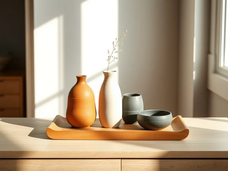
To master this balance, aim for the ‘rule of thirds’ and create intentional groupings. On a console table, place a tall ceramic vase with olive branches on one side, a stacked set of art books in the middle, and leave the remaining third completely empty. This crucial breathing room allows each individual object to be appreciated and gives the entire arrangement a sophisticated, gallery-like feel. Mix shapes and heights to create visual rhythm, pairing a round marble bowl with structured books and a tall, slender brass candlestick.
Avoid the mistake of scattering tiny knick-knacks across a surface; instead, focus on a few high-quality, substantial pieces that make a statement. By embracing negative space, you bring a sense of calm, order, and effortless luxury to your home’s flat surfaces, letting your favorite pieces truly shine.
Neglecting Textural Variation in Neutral Color Palettes
Designing a neutral space is incredibly popular for its timeless, calming appeal, but a common decor-mistakes pitfall is failing to introduce enough textural variation. When a room relies on a palette of creams, beiges, and grays without contrasting textures, it quickly feels flat, cold, and one-dimensional. To make a neutral room feel warm, inviting, and high-end, texture must become your primary design language.
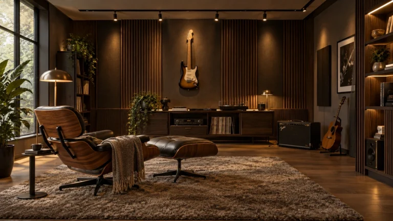
You want to layer a rich tapestry of tactile materials throughout the space. Combine a chunky, hand-woven wool rug with a smooth linen sofa, a rustic reclaimed wood coffee table, and soft velvet throw pillows. Introduce hard surfaces like polished marble, unlacquered brass, and matte ceramics to contrast against the soft textiles. Lighting plays a crucial role here; warm, low-level lighting from table lamps and wall sconces highlights the depth and shadows of these textured materials, making the room feel incredibly cozy at night.
Avoid the mistake of keeping all your fabrics in the same flat weave; instead, mix boucle, leather, linen, and silk to create a sensory-rich environment. This thoughtful layering of textures ensures your neutral palette feels sophisticated, dynamic, and layered with quiet luxury, proving that a colorless room can still be full of life.
9. Hanging Art Frames That Disregard Wall Proportions
One of the most common design missteps is hanging artwork that is far too small for the wall it occupies, or positioning it at an awkward height. When a small frame floats isolated on a massive plaster wall, it loses its impact and makes the entire room feel unfinished. Artwork should always relate directly to the scale of the wall or the furniture beneath it, acting as a visual anchor rather than an afterthought.
This principle is especially crucial in spacious living rooms, dining areas, and long hallways. Ideally, art should occupy roughly two-thirds to three-quarters of the width of the furniture piece it sits above, whether that is a tailored sofa or a wooden credenza. To ensure a cohesive connection, hang the artwork so the center of the piece sits at a standard eye level of 57 to 60 inches from the floor. If you are hanging a frame above furniture, leave a clean gap of six to eight inches between the bottom of the frame and the top of the furniture.
For an elevated, designer look, opt for oversized mats within thin, high-quality wood or metal frames to give smaller prints a grander presence. If you have a vast wall but only smaller pieces, group them into a tightly spaced gallery wall to create a singular, impactful focal point. Avoid scattering unrelated small frames across different walls, which distracts the eye and dilutes the room’s sophistication.
10. Restricting Natural Traffic Flow With Cramped Clearances
A room can feature the most exquisite furniture in the world, but if navigating the space feels like an obstacle course, the design fails. Cramped clearances and blocked pathways disrupt the natural energy of a home, making even large rooms feel restrictive and uncomfortable. Good space planning prioritizes human movement, ensuring that transitions from one zone to another are entirely effortless.
This flow is particularly vital in high-traffic areas like entryways, living rooms, and dining spaces. As a rule of thumb, major walkways require a minimum clearance of 30 to 36 inches to allow people to pass comfortably without turning sideways. In the seating area, keep the distance between the edge of your sofa and the coffee table between 14 and 18 inches, which is close enough to rest a drink but spacious enough to walk through easily.
To correct a cramped layout, avoid the temptation to push all your furniture flat against the walls, which actually highlights a room’s limitations. Instead, float your seating group toward the center of the room, grounding it with a generously sized area rug. If space is exceptionally tight, swap a rectangular coffee table for a round, leggy design crafted from warm travertine or white oak to soften the corners and ease movement. Always measure your clearances before purchasing new pieces to ensure your layout feels open and inviting.
11. Matching Every Metal Finish and Hardware Tone Identically
Purchasing matching sets of hardware, lighting, and plumbing fixtures is a shortcut that often results in a sterile, showroom-like environment. When every faucet, cabinet pull, and light fixture features the exact same polished chrome or brushed brass finish, the space loses its soul. A truly sophisticated home feels curated over time, and mixing metal finishes is the secret to achieving that coveted, designer-led depth.
This technique works beautifully in kitchens, bathrooms, and open-plan living areas where multiple fixtures are visible at once. The key to mixing metals successfully is to establish a dominant finish that makes up about 70 percent of the room’s metal surfaces, then introduce one or two accent metals for the remaining 30 percent. For instance, pairing rich, unlacquered brass cabinet hardware with a matte black kitchen faucet creates an engaging contrast that feels both intentional and timeless.
When choosing your metals, pay attention to the undertones. Cool metals like polished nickel and stainless steel pair beautifully with warm accents like antiqued bronze or satin brass. Avoid mixing more than three different finishes in a single space, as too many variations can look chaotic. By thoughtfully layering contrasting metals, you create a rich, tactile experience that feels deeply personal and elevated.
12. Scattering Tiny Decorative Accents Instead of Grounded Vignettes
A common decorating pitfall is the tendency to scatter small trinkets, tiny candles, and miniature picture frames across every flat surface in a room. While well-intentioned, this approach dilutes visual impact and creates a sense of clutter rather than curation. To elevate your surfaces, swap scattered accents for grounded, intentional vignettes that tell a cohesive design story.
This styling method works wonders on console tables, fireplace mantels, shelving units, and coffee tables. Instead of spreading items out evenly, group them together using the classic designer rule of threes. Combine objects of varying heights, shapes, and textures to create visual interest. For instance, pair a tall, textured ceramic vase holding organic branches with a stack of large art books, and top the books with a small brass bowl or a sculptural stone object.
To ground your vignettes, use a beautiful tray made of marble, woven cane, or polished wood to corral smaller items like candles or match strikes. This simple trick instantly transforms a collection of separate objects into a singular, cohesive design statement. Remember to leave plenty of negative space around your groupings; allowing a surface to breathe is just as important as the items you choose to display.
13. Ignoring the Natural Architectural Focal Point in Seating Layouts
Every well-designed room has an anchor—a natural focal point that draws the eye and dictates how the space should be experienced. When furniture layouts ignore this feature, perhaps by turning their backs on a stunning fireplace or blocking a beautiful garden view, the room feels disjointed and uncomfortable. Designing a seating arrangement that honors the room’s architecture is essential for creating a sense of balance.
This layout strategy is most impactful in living rooms, family spaces, and primary bedrooms. Identify your room’s primary architectural feature, whether it is a stone fireplace, a wall of floor-to-ceiling windows, or custom built-in shelving. Arrange your primary seating pieces, such as the sofa and armchairs, to frame and celebrate this feature rather than compete with it.
If your room has two competing focal points—such as a fireplace and a television—consider a layout that accommodates both. Placing a pair of elegant swivel chairs in the center of the room allows guests to easily rotate toward the fireplace for conversation or toward the television for entertainment. Avoid placing large, bulky furniture directly in front of windows, which blocks natural light and disrupts the connection to the outdoors. By aligning your furniture with the room’s natural architecture, you create an intuitive, harmonious flow.
14. Styling Accent Pillows and Throws of Uniform Shape and Fabric
A sofa styled with matching pillows in the exact same fabric, size, and shape can make a living room feel rigid, flat, and uninspired. While symmetry has its place, relying on uniform textiles robs a room of the inviting warmth and tactile depth that defines high-end design. To create a cozy, layered look, mix and match your accent pillows and throws with intention.
This styling technique is essential for living room sofas, sectional seating, and bedroom styling. Start by varying the scale and shape of your pillows. For a standard sofa, pair two large 22-inch square pillows in the corners with two 20-inch pillows in a contrasting texture, and finish the look with a single elongated lumbar pillow in the center. This layered scale immediately feels more dynamic and comfortable.
Next, focus on mixing rich, tactile materials. Combine a heavy, chunky knit throw with smooth linen pillows, structured velvet cushions, and perhaps a touch of supple leather. When it comes to color, pull tones from a cohesive palette—such as pairing warm terracotta and deep olive with neutral creams and taupes. For a high-end designer finish, swap synthetic pillow inserts for high-quality feather-down inserts, which drape beautifully and allow for that perfect, lived-in look.
15. Omitting Dedicated Task and Accent Lamps in Living Zones
Relying on a single overhead light source, such as a harsh flushmount or a grid of recessed ceiling cans, is one of the quickest ways to drain the warmth and ambiance from a room. Overhead lighting casts unflattering downward shadows and can make a beautifully decorated space feel sterile and cold. To create a welcoming, sophisticated atmosphere, you must layer your lighting.
This approach is particularly important in living rooms, bedrooms, and cozy reading nooks. A successful lighting plan incorporates three distinct layers: ambient (general overhead light), task (focused light for reading or working), and accent (soft light to highlight architectural details or artwork). By scattering table lamps, floor lamps, and wall sconces throughout the room, you create a warm, inviting glow at eye level.
When styling your lighting, place a sleek brass floor lamp next to a reading chair, and position a ceramic table lamp with a pleated fabric shade on a side table or console. Choose warm-white LED bulbs, ideally around 2700K, to mimic the gentle glow of candlelight. Avoid the mistake of using cool, blue-toned bulbs, which feel clinical. Layering your light sources allows you to adjust the mood of the room throughout the day, turning your living zone into a cozy sanctuary in the evening.
16. Hanging Drapery Panels That Fall Short of the Flooring
Few design mistakes disrupt the elegance of a room quite like drapery panels that stop several inches above the floor. Often referred to as ‘high-water’ curtains, short panels visually stunt a room, making the ceilings feel lower and the windows appear smaller than they actually are. Properly hung drapery should act as custom tailoring for your windows, elongating the walls and framing the view.
This rule applies to living rooms, dining rooms, and bedrooms alike. To achieve a high-end, designer look, always hang your drapery rods high and wide. Install the rod as close to the ceiling or crown molding as possible—ideally four to six inches above the window frame. Extend the rod 10 to 12 inches beyond the sides of the window frame, which allows the panels to sit outside the glass when open, maximizing natural light and making the window feel incredibly grand.
Your drapery panels should just kiss the floor, or puddle slightly by an inch for a more romantic, traditional feel. Opt for high-quality, heavy-weight materials like linen or velvet with a pinch-pleat header to ensure the fabric drapes in beautiful, structured folds. Avoid lightweight, unlined synthetic panels that flare outward at the hem. Investing in the correct length and hanging placement instantly elevates the entire room’s architecture.
17. Clashing Wood Undertones Without an Intentional Bridging Element
Mixing wood species is a hallmark of an elevated, collected home, but combining clashing wood undertones without a unifying element is a frequent decor-mistakes pitfall. When cool-toned grey oak sits directly next to a warm, orange-toned cherry wood, the space feels disjointed rather than curated. The secret to mixing woods successfully lies in identifying the dominant undertone and introducing a bridging element that marries the contrasting tones. This design strategy works beautifully in open-concept living rooms and dining areas where multiple wood pieces must coexist. To bridge the gap, introduce a multi-toned accent piece, such as a vintage chest that incorporates both warm and cool wood grains. Alternatively, you can use a large, neutral wool rug to physically separate the clashing furniture pieces, allowing the eye to transition smoothly between them. When styling, aim for a maximum of three distinct wood tones. Keep the dominant wood as your foundation, covering about sixty percent of the room’s wood surfaces. For the remaining pieces, balance the undertones by incorporating matte black iron or brass hardware, which acts as a visual palate cleanser. A designer-inspired tip is to look at the grain pattern: pair a tight, refined grain like walnut with a more rustic, open grain like white oak to create a sophisticated contrast that feels entirely intentional.
18. Assembling Gallery Walls Without Consistent Spatial Balance
A beautiful gallery wall should feel like a curated art exhibition, yet many homeowners fall into the trap of assembling frames without maintaining consistent spatial balance. When frames are hung too far apart, the collection loses its cohesion and begins to look like scattered visual noise. Conversely, crowding frames too closely together suffocates the artwork and creates an overwhelming focal point. This mistake is particularly noticeable in high-traffic areas like entryways, staircases, and the wall space directly above a living room sofa. To achieve a professional, balanced look, aim for a consistent spacing of two to three inches between every frame. Before hammering any nails, map out your arrangement on the floor or tape paper templates directly to the wall. This allows you to adjust the composition until the visual weight is evenly distributed. Keep the center of the entire gallery arrangement at eye level, which is approximately fifty-seven to sixty inches from the floor. For a sophisticated, cohesive feel, use frames made of similar materials, such as thin black metal or warm white oak, and stick to a unified color story in the artwork. A favorite designer tip is to mix different mediums—such as oil paintings, charcoal sketches, and photography—while keeping the matting uniform to tie the entire collection together seamlessly.
19. Prioritizing Pure Aesthetics Over Ergonomics and Daily Comfort
It is easy to fall in love with sculptural, magazine-worthy furniture, but prioritizing pure aesthetics over ergonomics and daily comfort is a major decor-mistakes misstep. A home should be a sanctuary, and a stunning living room loses its appeal if the sofa is too stiff for lounging or the dining chairs cause back fatigue. This issue most frequently disrupts family rooms, cozy reading nooks, and dining spaces where comfort directly impacts how long guests linger. To avoid this, seek out pieces that beautifully balance form and function. Look for sofas with a deep seat depth and a high-quality cushion fill, such as a down-wrap over a high-density foam core, which offers both structured support and plush comfort. Choose tactile, high-performance fabrics like Belgian linen, performance velvet, or supple top-grain leather that feel luxurious against the skin and wear beautifully over time. When selecting accent chairs, pair a highly sculptural, low-profile chair with a deeply cushioned, classic armchair to ensure everyone has a comfortable place to sit. Lighting also plays a crucial role in comfort; pair ergonomic seating with adjustable task lighting, such as a sleek brass floor lamp, to create a functional reading corner. The ultimate designer tip is to always test-sit furniture before buying, or carefully analyze the seat height and depth measurements to ensure they align with your household’s physical needs.
20. Mismatched Visual Weight Across Open-Concept Spaces
In modern open-concept spaces, maintaining a harmonious flow is essential, yet many layouts suffer from mismatched visual weight. This happens when one side of a room is crowded with dark, bulky furniture—like a massive charcoal sectional—while the opposite side features only light, leggy pieces. This imbalance tilts the room’s energy, making the space feel lopsided and uncomfortable. This issue is most common in great rooms that combine the kitchen, dining, and living areas into one expansive zone. To resolve this, distribute heavy and light elements evenly across the entire open area. If you have a substantial, dark oak dining table on one side, balance it by placing a deeply upholstered sofa or a dark-painted accent cabinet on the other. Mix materials to create visual equilibrium: pair a chunky plaster coffee table with airy, open-frame accent chairs in black steel. Use color combinations strategically by repeating accent tones—such as warm terracotta or deep olive green—in accessories, textiles, and art across all zones to visually connect the spaces. Lighting can also help distribute visual weight; hang a large, sculptural chandelier over the dining table to anchor that zone, and balance it with a striking floor lamp in the living area. A designer-favorite trick is to stand at the entrance of your open-concept space, squint your eyes, and notice where the dark and light masses fall; they should feel beautifully balanced across your field of vision.
21. Neglecting Warm Color Temperatures and Dimmers on Lighting
One of the most common decor-mistakes that instantly drains the warmth from a beautifully designed room is neglecting light temperatures and dimmers. Relying on cool, bluish-white LED bulbs—often in the 4000K to 5000K range—creates a sterile, clinical atmosphere reminiscent of an office. Furthermore, relying on a single, bright overhead light source flattens the room’s textures and ruins the evening ambiance. This issue is particularly detrimental in intimate spaces like bedrooms, living rooms, and dining areas where relaxation is paramount. To fix this, always select bulbs with a warm color temperature of 2700K, which mimics the gentle, golden glow of candlelight. Additionally, installing dimmer switches on all overhead fixtures is a non-negotiable step for controlling the room’s mood. Layer your lighting by combining ambient overhead fixtures, functional task lamps, and soft accent lighting. Use high-quality materials like brass, ceramic, and pleated linen shades to diffuse the light and add a layer of sophisticated texture. Position table lamps and floor lamps at eye level or lower to eliminate harsh shadows and create pockets of inviting warmth. A designer-inspired tip is to use plug-in dimmers for your table lamps, allowing you to dial down the light to a soft whisper in the evening, instantly transforming your living space into a cozy, high-end retreat.
22. Treating Indoor Plants and Botanical Elements as Afterthoughts
Bringing nature indoors is essential for a finished look, but treating indoor plants and botanical elements as afterthoughts often leads to cluttered, unpolished spaces. Placing tiny, struggling supermarket plants in mismatched plastic pots on random surfaces does little to elevate your home. Instead, it creates visual clutter and disrupts the clean lines of your interior. This mistake is easily corrected in empty corners, adjacent to large furniture pieces, or on spacious entry consoles. To make a sophisticated statement, prioritize scale and intention. Invest in one or two large, architectural plants, such as a Fiddle Leaf Fig, a tall Olive Tree, or a dramatic Money Tree. House them in premium, organic vessels made of terracotta, raw stoneware, or aged ceramic to add rich texture. If you have low-light areas, opt for high-quality faux branches—such as quince, eucalyptus, or maple—placed in a heavy, vintage-inspired crock. Position your botanicals where they can catch soft, natural light, which enhances their organic beauty and casts elegant shadows on the walls. When styling, remember that a single, dramatic vessel filled with tall, structural branches on a console table often looks far more sophisticated and expensive than a collection of small potted plants. A designer tip is to use preserved moss to cover the soil in your planters, hiding plastic nursery pots and providing a clean, professional finish.
23. Crowding Open Bookshelves Without Strategic Breathing Room
Open bookshelves offer an incredible opportunity to showcase personality, but crowding them without strategic breathing room is a frequent styling error. Packing every shelf tightly with books from end to end creates a heavy, chaotic wall of visual clutter that suffocates the room. This issue is most prominent in living room built-ins, home offices, and freestanding étagères. To create a sophisticated, designer-worthy display, embrace the concept of negative space. Aim to leave approximately thirty to forty percent of each shelf empty, allowing the eye to rest and appreciate the curated items. Instead of lining books up uniformly, mix their orientation. Create horizontal stacks of art books to act as pedestals for small sculptural objects, and stand other books vertically, anchoring them with beautiful bookends. Incorporate a mix of materials, such as matte ceramic vases, brass objects, and framed vintage artwork, to break up the paper textures. Keep your color palette cohesive by grouping books with neutral or complementary spines, or turn colorful books inward for a more muted, minimalist look. Soften the display by placing a small, trailing plant on a higher shelf to spill over the edge. A designer-inspired tip is to paint the back wall of your bookshelves a slightly darker, contrasting shade than the surrounding room to add instant depth and make your curated vignettes pop.
Frequently Asked Questions
What is the most common decor mistake homeowners make when arranging living room furniture?
One of the most frequent errors is pushing all seating flat against the perimeter walls. Many assume this makes a room look larger, but it actually disconnects the space and creates dead zones in the center. Pulling seating just a few inches or feet away from the walls—known as ‘floating’ furniture—immediately establishes cozy conversation areas and improves natural flow. Pair this adjustment with an appropriately sized rug that grounds the front legs of each seat, and your room will instantly feel more inviting, deliberate, and structurally balanced.
How can I tell if my artwork is hung at the wrong height?
If you have to crane your neck upward to look at the center of your framed print or canvas, it is hung too high. A reliable standard used by art galleries and interior designers is positioning the center point of the piece between 57 and 60 inches from the finished floor. When hanging art above a piece of furniture like a sofa or console, leave roughly six to eight inches of breathing space between the top of the furniture and the bottom of the frame to keep them visually connected.
Can you mix different metal finishes and wood tones in one space?
Absolutely. Matching every finish creates a sterile, catalog-like feel rather than an organic, collected home. The secret to mixing metals or wood undertones is intent and balance. Choose one dominant finish for about sixty to seventy percent of the room, then introduce one or two contrasting accents. To make wood undertones harmonize, include a bridging element—such as a patterned rug, textile, or multi-toned accent piece—that incorporates both species. Repeating each finish at least twice ensures the variation looks curated rather than accidental.
What is an easy, budget-friendly fix for a room that feels cold and uninviting?
Lighting and light bulb temperature are usually the quickest culprits to solve. Harsh, cool-toned overhead bulbs strip rooms of coziness. Switch out high-kelvin bulbs for warm white options around 2700K to instantly soften your space. Next, turn off the single central ceiling fixture and add layered lighting. Introducing a pair of warm table lamps, a low-profile floor lamp, or plug-in picture lights distributes illumination evenly, eliminating sharp shadows and creating the welcoming ambiance typical of professional interior design.
How do I fix decorative clutter on open shelving and coffee tables?
The simplest remedy is embracing negative space and the power of grouping. Instead of spreading individual small trinkets evenly across surfaces, group decor into deliberate vignettes using the rule of three. Vary heights, shapes, and materials within each grouping—such as pairing a tall brass candlestick with a low ceramic bowl and a stack of books. Crucially, leave at least one-third of the surface empty so your favorite pieces have visual breathing room to stand out.
How far above the floor should window drapery hang?
Drapery panels should never end several inches above the baseboard, as ‘floating’ curtains visually truncate your walls and lower ceiling height. For an elevated, tailored look, hang your curtain rod high—typically halfway between the window trim and ceiling or crown molding—and extend it past the window frame. Ensure the fabric panels lightly kiss the floor or break with a subtle half-inch puddle. This elongates the vertical plane of the room and makes your windows appear substantially grander.
Conclusion
Perfecting your home does not require an endless budget or a disruptive gut renovation; more often than not, visual refinement comes down to mastering the subtle nuances of scale, light, and arrangement. By recognizing where everyday decor mistakes happen—whether it is an undersized rug, misjudged wall art, or insufficient ambient lighting—you unlock the ability to see your living spaces with a designer’s trained eye.
Instead of feeling overwhelmed by a long list of adjustments, pick just one or two small tweaks to tackle first. Lower a prominent art piece to eye level, pull a sofa a few inches away from the wall to let the room breathe, or swap out a harsh overhead bulb for warm, layered accent lamps. These thoughtful edits build on one another, creating an immediate ripple effect of balance and sophistication throughout your home.
Remember that creating an enduring, beautiful environment is a dynamic and personal process. As you experiment with proportion, texture, and negative space, trust your instincts and enjoy the transformation. With a few intentional adjustments, your home will soon reflect the effortless harmony, comfort, and polish you have always envisioned.