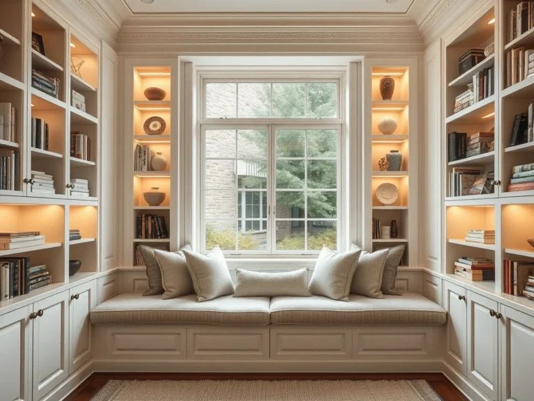
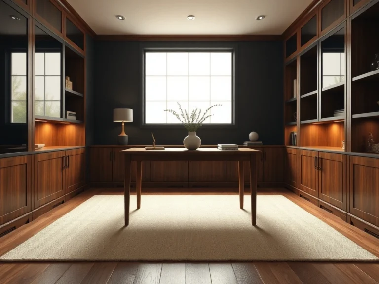
A beautifully styled bookshelf is more than just a storage solution; it is a focal point that tells the story of your home. Yet, transforming a functional bookcase into a sophisticated display often feels easier said than done. If you are staring at cluttered shelves or uninspiring empty spaces, mastering a few key bookshelf styling ideas can completely elevate the energy of your entire room.
It is easy to feel overwhelmed by the styling process. Many homeowners struggle to balance the visual weight of heavy novels with delicate decorative objects, often resulting in shelves that look either chaotic and overcrowded or cold and unfinished. Finding that perfect harmony between books, art, and personal treasures requires a thoughtful approach to scale, texture, and negative space.
The good news is that you do not need an unlimited budget or a professional design degree to achieve a curated, magazine-worthy look. By applying foundational interior design principles—like the visual triangle rule, layering techniques, and strategic editing—you can transform any standard shelving unit into a custom-designed feature.
In this guide, we will break down twenty timeless styling strategies to help you arrange your books, showcase your favorite decor, and create a balanced, sophisticated display you will love looking at every day. Let us begin.
Alternate Between Vertical and Horizontal Book Stacks
Styling a bookshelf is an art of balance, and alternating between vertical and horizontal book stacks is the easiest way to break up visual monotony. Placing every book vertically creates a sterile, library-like feel. By laying some books flat in horizontal stacks, you instantly create dynamic pedestals that elevate smaller decorative objects, while vertical rows provide structure and height. This technique works exceptionally well on living room built-ins and open-back étagères where you want to foster a relaxed, collected atmosphere. Try grouping five to seven books vertically, then placing a stack of three larger hardcovers horizontally right next to them. Pop a small brass bowl or a hand-carved wooden object on top of the horizontal stack to complete the look. When selecting books, look for textured linen or cloth covers in cohesive tones like warm oatmeal, sage green, and charcoal. If your books have brightly colored, glossy dust jackets that clash with your room’s aesthetic, simply slip them off to reveal the beautiful, understated hardcovers underneath. To avoid a cluttered look, keep your stacks organized by size, placing the largest book at the bottom of horizontal piles. Highlight this arrangement with warm brass picture lights mounted above the shelves to cast a soft, museum-quality glow over the different heights and textures.
Apply the Visual Triangle Method for Balanced Groupings
The visual triangle method is a foundational interior design secret used to create balance and rhythm across shelving units. Instead of arranging items randomly, you place pieces of similar color, material, or visual weight in an imaginary triangular pattern. This guides the viewer’s eye seamlessly across the entire bookcase rather than letting it get stuck in one heavy spot. This approach is particularly effective for expansive fireplace built-ins or large wall units that can easily look overwhelming. For example, if you have three matte white ceramic vases, place one on the upper left shelf, one on the middle right shelf, and the third on the bottom left shelf. The eye naturally connects these points, creating an effortless sense of harmony. To make this work, choose a unifying element for your triangles, such as polished brass accents, warm oak details, or rich black pottery. Mix up the scale within each triangle so the groupings do not look too matching or forced. A common mistake is placing all heavy, dark items on the bottom shelves and light items on top. Instead, distribute the visual weight evenly using the triangle method, and illuminate the setup with subtle, under-shelf LED strip lighting to accentuate the depth and flow of your curated arrangement.
Introduce Organic Texture with Fresh or Faux Greenery
Every well-styled bookshelf needs a touch of organic life to soften the rigid, linear structure of the shelves and books. Introducing greenery brings movement, fresh color, and a natural softness that instantly makes a room feel lived-in and inviting. It breaks up the hard right angles of book spines and wooden dividers with fluid, organic shapes. This styling trick works best on higher shelves, where trailing plants like pothos, ivy, or string of pearls can gracefully drape over the edges. On eye-level or lower shelves, opt for structured botanicals such as a low ceramic bowl filled with preserved moss or a minimalist stoneware vase holding a few structural eucalyptus branches. When choosing containers, look for textured clay pots, glazed terracotta, or hand-painted stoneware that complements your room’s color palette. If your shelves are positioned in a dark corner with limited natural light, invest in high-quality faux botanicals. The key is to look for realistic details like wired stems that you can shape yourself and varied leaf tones. Avoid cluttering your shelves with too many tiny potted plants, which can look messy. Instead, stick to one or two statement botanical pieces per shelving unit, ensuring they have plenty of breathing room around them to stand out as sculptural highlights.
Layer Framed Art and Photography Behind Objects
Layering framed art and photography is a designer favorite for adding depth and personality to bookshelves. Instead of treating the back of your shelves as dead space, leaning artwork against the back wall creates a rich, multi-dimensional backdrop. It instantly transforms a standard bookcase into a curated gallery. This technique works beautifully on deep built-in shelves or wide console units where you have the physical space to overlap objects. Begin by leaning a medium-sized framed sketch, vintage oil painting, or black-and-white photograph against the back of the shelf. Then, place a stack of horizontal books or a small ceramic object slightly in front of it, partially obscuring the lower corner of the frame. For a sophisticated look, mix your frame styles and art mediums. Pair a delicate, gilded vintage frame with a modern, clean-lined black metal frame. Keep the artwork cohesive by sticking to a shared color story, such as sepia tones, moody landscapes, or minimalist charcoal line drawings. A common mistake is hanging the artwork perfectly centered on the shelf back. Leaning the frames looks much more relaxed, effortless, and allows you to easily swap pieces out whenever you want a fresh look. Illuminate these layered vignettes with directional spotlights to highlight the textures of the canvas and frames.
Embrace Negative Space to Let Key Pieces Breathe
One of the hardest lessons in interior design is learning when to stop. Embracing negative space—the empty areas around your decor—is essential for creating a sophisticated, high-end look. When every inch of a bookshelf is packed with objects, nothing stands out, and the overall effect is chaotic. Empty space gives your favorite pieces room to breathe and commands attention. This concept works beautifully in modern, minimalist living spaces and home offices where a calm, focused environment is desired. Try dedicating at least one-third of your shelf space to absolutely nothing. For instance, on a long shelf, you might have a beautifully curated grouping on one side and leave the other side entirely empty, save for the natural grain of the wood. To make negative space feel intentional rather than unfinished, choose high-contrast materials. A single, dark charcoal stone sculpture resting on a pale oak shelf looks incredibly striking when surrounded by empty space. Avoid the temptation to fill every gap with small knick-knacks. Instead, edit your collection ruthlessly. Think of your shelves as a high-end boutique or an art gallery where each object is selected for its individual beauty and architectural form.
Incorporate Sculptural Bookends as Functional Art
Bookends should never be an afterthought. Incorporating sculptural bookends is a brilliant way to merge essential functionality with high-end art. Instead of relying on basic metal brackets, choosing substantial, artistic bookends elevates your books into a striking design feature while keeping them neatly organized. This styling choice works best at eye-level shelves where the intricate details and luxurious materials of the bookends can be fully appreciated. Use a pair of heavy stone bookends to frame a small, curated selection of art and design monographs. Alternatively, use a single, heavy sculptural piece to support a casual stack of books leaning gracefully at an angle. Look for premium materials that add texture and luxury to your shelves. Honed marble, translucent alabaster, raw cast iron, and solid unlacquered brass are excellent choices that look beautiful even when standing alone. A common mistake is using lightweight bookends that slide under the weight of heavier books, causing them to lean messily. Invest in solid, heavy-weight pieces that offer both physical stability and visual gravitas. For an elevated designer touch, look for vintage stone or brass bookends at antique shops. These unique finds bring a sense of history, soul, and character that mass-produced items simply cannot replicate.
Mix Materials by Blending Wood, Ceramic, and Metal
A beautifully styled bookshelf relies heavily on tactile contrast. Mixing materials by blending wood, ceramic, and metal prevents your shelves from looking flat, sterile, or overly matched. When you combine different textures, you create a rich, layered look that feels sophisticated and thoughtfully collected over time. This technique is highly effective on large, open-back étagères or floor-to-ceiling library walls where the repetition of books can feel heavy. To execute this, group objects of contrasting materials together. For example, place a rough, matte ceramic vase next to a sleek, polished brass candle holder, all resting on a warm, natural walnut shelf. The interplay between rough and smooth, shiny and matte, and organic and industrial is what makes the composition visually exciting. Consider incorporating materials like woven rattan, unlacquered brass, honed travertine, and textured linen-wrapped books. Keep the color palette cohesive—such as warm neutrals, creams, and metallic accents—to ensure the mix of materials feels unified rather than chaotic. Avoid the mistake of sticking to one theme or material, like using only rustic wood or only shiny chrome, which can make your home look like a showroom rather than a personalized space.
Use Decorative Boxes and Bowls to Hide Clutter
Even the most design-conscious homes have everyday items that need a place to live but aren’t particularly beautiful to look at. Using decorative boxes and bowls is the ultimate designer secret for hiding functional clutter while adding structure and elegant shapes to your bookshelves. This strategy works best on lower shelves or at eye-level in high-traffic areas like family rooms and home offices. Use a large, structured box made of rich burl wood, woven rattan, or textured shagreen to conceal game controllers, charging cords, or loose paperwork. On middle shelves, style a shallow marble or ceramic bowl to hold smaller items like keys, matches, or even left empty as an elegant, sculptural element. When choosing boxes, look for high-quality closures and interesting textures that contrast with your shelves. A stack of two coordinating boxes in different sizes adds architectural height and interest to a shelf while doubling your hidden storage capacity. Avoid using cheap plastic storage bins or boxes that are too small, as they can end up looking like clutter themselves. Instead, invest in substantial, beautiful containers that look like high-end decorative objects in their own right, seamlessly blending utility with sophisticated style.
Curate a Cohesive Color Palette Using Book Spines
Curating a cohesive color palette using your book spines is an effortless way to transform visual clutter into a sophisticated design statement. When book covers clash, the entire room can feel disorganized. By grouping books by tonal families, you instantly create a sense of order and intention that feels incredibly polished. This approach works beautifully in high-traffic areas like living rooms or open-concept spaces where bookshelves serve as a primary focal point.
To execute this like a professional designer, start by removing paper dust jackets. Underneath, you will often find gorgeous linen, cloth, or matte boards in rich, unexpected shades. Instead of a rigid rainbow gradient—which can sometimes feel a bit youthful—aim for a sophisticated, edited palette. Think warm neutrals mixed with earthy terracotta, sage green, and deep navy, or stick to a serene monochromatic scheme of cream, beige, and charcoal.
A common mistake is trying to force every single book you own onto the shelves. Be selective, and store books that do not fit your palette elsewhere. For those must-keep volumes that disrupt the color flow, consider wrapping them in high-quality neutral kraft paper or textured linen covers. Pair your curated book groupings with brass or matte black bookends to add a touch of metallic warmth and structural contrast.
Turn Books Backward for a Minimalist Neutral Aesthetic
Turning books backward so their pages face outward is a beloved designer secret for achieving an ultra-minimalist, cohesive aesthetic. This technique instantly solves the problem of clashing, vibrant spines by hiding them in favor of the soft, uniform texture of paper edges. The resulting palette of warm creams, soft beiges, and aged tan tones creates a soothing, neutral backdrop that feels incredibly peaceful. It is an ideal solution for serene spaces like primary bedrooms, quiet home offices, or cozy reading nooks where you want to minimize visual stimulation.
To make this look intentional rather than accidental, vary your styling layouts. Alternating between vertical rows and horizontal stacks is key to creating a dynamic sense of movement. Use a heavy, horizontal stack of backward books as a pedestal to elevate a small brass sculpture or a scented candle.
The biggest critique of this method is practicality, so avoid doing this to books you consult daily. Instead, reserve this styling trick for novels you have already read or decorative vintage finds. To elevate the look, pair these warm paper tones with natural materials like travertine bookends, raw white oak details, and matte black iron accents. The contrast between the soft, organic paper and the hard, structured materials creates a beautifully balanced, editorial vignette that feels curated over time.
Elevate Deep Built-In Shelves with Wallpapered Backdrops
Deep built-in shelves offer incredible storage, but they can easily become dark, cavernous voids that swallow up your decor. Adding a wallpapered backdrop is a brilliant way to bring light, texture, and architectural depth to these recessed spaces. By lining the back of your shelves, you create a beautiful, high-contrast canvas that frames your books and decorative objects, making every item pop. This technique works exceptionally well in living room built-ins, dining room china cabinets, or home libraries.
For an elegant, timeless look, opt for textured wallpapers such as natural grasscloth, woven linen, or subtle tonal patterns. A soft cream, warm beige, or muted slate blue grasscloth adds incredible tactile warmth without overwhelming the senses. Avoid overly busy, high-contrast patterns, which can make the shelves feel cluttered and chaotic before you even begin styling.
When styling against a patterned or textured backdrop, lean into the “less is more” philosophy. Leave plenty of negative space so the beautiful wallpaper can peek through. Group white ceramic vases, clear glassware, or metallic accents in front of the backdrop to catch the light. A designer-favorite installation tip is to wrap lightweight foam-core boards in your chosen wallpaper and slide them snugly into the back of each shelf. This allows you to achieve a custom, high-end look without permanently altering your cabinetry.
Integrate Personal and Sentimental Travel Souvenirs
A truly beautiful bookshelf should tell the story of the people who live in the home. Integrating personal and sentimental travel souvenirs is the ultimate way to infuse soul, warmth, and individuality into your styling. It prevents your shelves from looking like a sterile department store display and instead turns them into a curated gallery of your life’s adventures. This approach works best on eye-level shelves in communal spaces like living rooms and dens, where these unique treasures can naturally spark conversations with guests.
The key to styling sentimental objects is curation and restraint. Avoid the common mistake of overcrowding your shelves with dozens of small, unrelated trinkets. Instead, select a few meaningful, high-quality pieces—such as a hand-carved wooden bowl from a mountain trip, a piece of white coral from a beach vacation, or a hand-painted ceramic vessel from an artisanal market.
To style these pieces cohesively, pair them with neutral-toned books and natural materials. Rest a sculptural stone object on top of a horizontal stack of art books to give it height and prominence. Group smaller items in odd numbers, like a trio of varying heights, to create a pleasing visual rhythm. By surrounding your personal treasures with plenty of negative space, you highlight their unique beauty and ensure they feel like intentional design choices rather than random clutter.
Use Varying Heights and Scale to Draw the Eye Upward
One of the most common mistakes in bookshelf styling is placing objects of the same height next to one another, which creates a flat, monotonous line that fails to capture the imagination. To create a dynamic, professional-looking display, you must use varying heights and scales to guide the eye upward and across the shelves. This technique introduces a sense of architectural movement, making your bookcases feel grander and more cohesive. It works beautifully on tall, floor-to-ceiling built-ins or large freestanding wall units.
To master this concept, think of your shelves as a landscape of peaks and valleys. Combine tall, vertical design elements—such as a slender ceramic vase holding delicate dried branches, or a beautifully framed piece of art—with low, horizontal elements, like a stacked trio of oversized coffee table books.
When arranging your items, utilize the designer-approved “zigzag” method. If you place a tall, dominant object on the far left of the top shelf, place your next tall object on the right side of the middle shelf, and another on the left side of the bottom shelf. This diagonal flow naturally coaxes the eye to dance across the entire unit. Don’t be afraid to use scale to your advantage; a single, large, statement-making vessel often looks far more sophisticated and expensive than a cluster of five small, insignificant items.
Display Collected Ceramics and Matte Pottery
Displaying collected ceramics and matte pottery is a wonderful way to introduce rich, organic texture and artisanal warmth to your bookshelves. The tactile, imperfect nature of handmade ceramics beautifully offsets the flat, rigid lines of book spines and wooden shelves. This styling choice works exceptionally well in open-concept kitchens, dining rooms, and modern living spaces where you want to foster a relaxed, collected-over-time atmosphere.
When selecting pottery, prioritize matte, textured, or unglazed finishes over highly glossy glazes. Matte surfaces absorb light rather than reflecting it, creating a softer, more sophisticated look under ambient room lighting. Combine different clay bodies—such as rough terracotta, speckled stoneware, and smooth, chalky white ceramic—to build a rich tapestry of textures. Stick to an earthy, grounded color palette of sand, charcoal, olive green, and warm rust to keep the display cohesive.
To style these pieces like a professional, group them in thoughtful clusters of three. Choose vessels with contrasting silhouettes, such as a tall, slender neck pitcher, a round, bulbous vase, and a low, footed bowl. Place the tallest piece slightly behind the others to create depth. For an extra touch of life, insert a few stems of dried eucalyptus or delicate wildflowers into one of the vessels, leaving the others empty to emphasize their beautiful, sculptural forms.
Create Warmth with Small Battery-Operated Accent Lights
Lighting is the secret ingredient that elevates a standard bookshelf into a dramatic, high-end architectural feature. Integrating small, battery-operated accent lights is a brilliant, budget-friendly way to introduce cozy warmth and depth without dealing with the hassle of messy cords or expensive electrical work. This styling technique works beautifully in deep built-ins, dark corners, or moody home libraries, instantly transforming them into inviting focal points as evening falls.
There are several stylish ways to incorporate cordless lighting into your bookshelf design. You can mount battery-operated brass picture lights directly above the top frame of your bookcase to wash the entire display in a warm, gallery-like glow. Alternatively, place a miniature, cordless LED table lamp with a beautiful metal or alabaster shade directly onto one of the middle shelves.
When selecting your bulbs or light sources, always opt for warm-toned LEDs (around 2700K or lower). Cool white light can feel clinical and harsh, whereas warm light mimics the comforting flicker of candlelight. A great designer tip is to hide small, wireless puck lights with remote controls underneath the upper shelves to cast a soft downlight onto your favorite sculptures or book arrangements. This simple addition creates a luxurious, layered lighting scheme that makes your entire living space feel incredibly high-end.
Arrange Books by Genre or Subject for an Authentic Library Feel
While visual styling is important, there is an undeniable charm to a bookshelf that prioritizes genuine utility and intellectual passion. Arranging your books by genre or subject creates an authentic, lived-in library feel that celebrates your love for reading while remaining highly organized. This approach works best in dedicated home offices, cozy reading nooks, or grand floor-to-ceiling libraries where you want your collection to feel both accessible and sophisticated.
To execute this layout beautifully, begin by categorizing your books into broad, meaningful subjects, such as art, travel, history, biography, and fiction. Instead of packing the books tightly from wall to wall—which can look heavy and overwhelming—incorporate breathing room on each shelf. Use heavy, high-quality bookends made of solid marble, warm walnut, or polished brass to neatly partition your different genres.
To elevate the visual appeal of this functional arrangement, intersperse small framed art prints, vintage oil paintings, or family photographs directly onto the shelves next to your book groupings. Lean these frames casually against the back of the shelf or use them to lean books against. Designer tip: on shelves dedicated to larger art or travel books, stack them horizontally to create natural pedestals for small, interesting objects. This clever mixing of horizontal and vertical planes ensures your authentic library feels curated, artistic, and visually engaging.
17. Place Heavy, Oversized Art Books on Bottom Shelves
In professional interior design, we often talk about visual gravity—the concept that heavier elements should naturally settle toward the bottom of a composition to create a sense of stability. Placing your largest, heaviest oversized art and coffee table books on the lower shelves is the ultimate execution of this principle. When weighty volumes are placed too high, they threaten to make the entire shelving unit feel top-heavy and visually precarious.
This approach works beautifully in expansive living room built-ins or deep library shelves where the lower sections have more physical depth. Instead of lining these books up vertically, stack them horizontally in neat groups of two or three. This acts as a solid, structural pedestal that grounds the entire unit and breaks up the monotony of vertical spines.
To style these stacks like a designer, top them with a singular, low-profile decorative object. A heavy brass chain link, a piece of raw petrified wood, or a shallow stoneware bowl adds an organic layer of texture. Opt for books with neutral linen spines or elegant, matte-finish dust jackets in cohesive tones like cream, charcoal, and warm terracotta.
A common mistake is packing the bottom shelves so tightly that they resemble storage lockers. Instead, leave generous breathing room on either side of your book stacks. If your shelves feature integrated lighting, position under-shelf warm LED strips to cast a soft downward glow over the textured covers, transforming a utilitarian base into a beautifully curated gallery foundation.
18. Anchor the Display with a Singular High-Impact Statement Piece
Every well-designed space needs a focal point, and your bookshelves are no exception. Rather than filling every nook with small, disparate knick-knacks—which quickly translates to visual clutter—anchor your display with a singular, high-impact statement piece. This designer technique instantly elevates the entire room by giving the eye a sophisticated place to rest and establish a clear visual hierarchy.
This strategy is incredibly effective on eye-level shelves or within the central compartment of a large built-in unit. Choose an object that possesses both scale and personality. A large, organic plaster bust, an antique terracotta vessel, or a dramatic, hand-carved travertine sculpture works beautifully. The key is to select a piece that feels sculptural and stands at least two-thirds the height of the shelf cavity.
To make this styling choice look intentional, surround the statement piece with plenty of negative space. Resist the urge to flank it with books or balance smaller objects nearby; let the piece breathe and command the shelf. If you are styling a deep shelf, you can subtly layer a small, framed sketch or abstract painting behind the object to add depth without competing for attention.
Avoid the temptation to use highly polished, reflective materials that catch harsh glare. Instead, lean into matte, tactile surfaces that absorb light softly. Accentuate this focal point by installing a brass picture light directly above the shelf, casting a warm, museum-like wash of light over your curated treasure and highlighting its unique contours and textures.
19. Style Shelves Symmetrically for a Formal, Traditional Look
For homeowners who appreciate a classic, refined aesthetic, styling shelves symmetrically is a timeless method that brings instant order and architectural elegance to a room. Symmetry naturally communicates sophistication and calm, making it the perfect approach for formal dining rooms, traditional home offices, or built-in bookshelves that flank a grand fireplace.
To master this look, establish a clear central axis and mirror the visual weight on either side of your shelving unit. This doesn’t mean every single object must have an identical twin, but the silhouettes, heights, and volumes should balance one another perfectly. For instance, if you place a tall, white ceramic urn on the left side of a shelf, balance it on the right with a similarly scaled glass vessel or a structured stack of books topped with a decorative object of equal height.
Incorporate premium materials that enhance this formal structure. Think polished marble bookends, classic leather-bound volumes, and accents of oil-rubbed bronze or antiqued brass. A sophisticated color palette of deep forest green, rich navy, and warm ivory works exceptionally well here, creating a cohesive and tailored look that feels incredibly intentional.
The most common mistake when styling symmetrically is executing it with clinical precision, which can make the space feel stiff and uninviting. Instead, strive for visual equivalence rather than identical duplication. For example, use books of similar tones but different titles on opposing sides. Complete the look by installing matching library sconces at the top of each shelving section, casting an even, inviting glow that celebrates the harmonious balance below.
20. Contrast Dark Shelf Backings with Light-Colored Decor
If your bookshelves feature a moody, dark backing—whether painted in a rich charcoal, deep forest green, or lined with a textured walnut veneer—the secret to making them look spectacular is high-contrast styling. Placing light-colored decor against a dark backdrop creates an exquisite chiaroscuro effect. This design technique makes every object pop, emphasizing their unique silhouettes and turning your shelving unit into a dramatic, three-dimensional work of art.
This approach is exceptionally powerful in cozy libraries, modern living rooms, or sophisticated bar areas where you want to cultivate an intimate yet high-end atmosphere. To execute this styling formula, curate a collection of pale, texturally rich decorative pieces. Think matte white stoneware, carved alabaster bowls, bleached oak sculptural objects, and books with crisp cream or light linen spines.
The contrast between the dark, recessive background and the bright, forward-facing objects instantly adds depth to the room. Introduce warm metallic accents, such as brushed brass or polished copper, to bridge the gap between light and dark. These warm tones catch the light beautifully and add a layer of luxurious warmth to the cool contrast.
A common pitfall is using dark or highly saturated items that simply disappear into the background, resulting in a muddy, indistinct display. Always check your compositions from across the room to ensure every piece stands out clearly. To elevate the drama further, incorporate integrated LED strip lighting hidden behind the front lip of each shelf. This directs light backward and downward, casting a soft glow that beautifully defines the light objects against their dark, dramatic backdrop.
Frequently Asked Questions
How do I style a bookshelf if I actually have a massive book collection?
You do not have to sacrifice your love of reading for style. The key is organizing your collection with intention. Try grouping books by color to create a cohesive visual flow, or organize them by genre while leaving small pockets of breathing room. Mixing vertical alignments with horizontal stacks instantly breaks up the monotony of a traditional library. You can also place small decorative objects or trailing plants on top of horizontal book stacks to weave in personality without losing precious storage space for your favorite titles.
What is the “one-third rule” in bookshelf styling?
The one-third rule is a classic interior design guideline that helps you achieve a perfectly balanced look. Ideally, your styled bookshelf should consist of one-third books, one-third decorative objects (like art, vases, and plants), and one-third empty space. This empty space, or negative space, is crucial because it gives the eye a place to rest and prevents your shelves from feeling cluttered or overwhelming. It allows your most cherished items to truly stand out rather than getting lost in the crowd.
How can I style my shelves on a budget without buying expensive decor?
The best way to style shelves affordably is to “shop your home.” Look for unique items you already own, such as vintage ceramic bowls, interesting glassware, travel souvenirs, or even pretty perfume bottles. You can also bring the outdoors in by foraging branches or propagating houseplants. For the books themselves, try removing worn paper dust jackets to reveal the beautiful, classic linen hardbacks underneath. This instantly gives your collection a high-end, sophisticated look without spending a single penny.
Should I arrange my books by color or is that trend outdated?
Arranging books by color is a personal choice, and it remains a popular way to create a clean, cohesive look. If a full rainbow gradient feels too bold or playful for your space, try a more refined approach. You can group books in subtle color blocks—such as all neutrals, blues, or dark tones—to create a sophisticated, curated feel. If you prefer a traditional look, organizing by topic or author is always enduring and makes finding your favorite reads much easier.
How do I prevent my styled bookshelves from looking cluttered?
Clutter happens when there are too many small, unrelated items competing for attention. To avoid this, focus on grouping objects in odd numbers—usually threes—and vary their heights. Use larger, high-impact pieces rather than dozens of tiny knick-knacks. If you have small items you want to keep on the shelves, corral them inside decorative boxes or woven baskets. Finally, step back frequently during the styling process to evaluate the overall balance and remove anything that feels unnecessary.
What is the best way to style deep built-in shelves?
Deep shelves can be tricky because items can get lost in the shadows. To master deep shelving, think in layers. Place larger items, like framed artwork or large platters, flat against the back wall of the shelf. Next, place your books in front of them, and layer smaller decorative objects or candles in the very front. This creates a beautiful sense of depth and dimension, making the most of the deep space while ensuring every piece is visible and beautifully highlighted.
Conclusion
Styling a bookshelf is a rewarding creative process that transforms a simple storage unit into a captivating reflection of your personal style. By thoughtfully balancing your book collection with curated art, natural textures, and meaningful keepsakes, you can create a sophisticated focal point that elevates the entire room. Remember that the most successful displays rely on the clever interplay of heights, textures, and essential negative space to let each piece shine.
If you are feeling overwhelmed, remember that you do not have to tackle your entire shelving unit all at once. Start small by choosing just one or two styling ideas from this guide—perhaps experimenting with a few horizontal book stacks or incorporating a touch of fresh greenery. As you begin to play with layout and balance, you will quickly find your design confidence growing, allowing you to edit and refine your shelves over time.
Ultimately, there is no single right way to style a bookshelf. The most beautiful shelves are those that feel collected, authentic, and uniquely yours. Embrace the process, enjoy experimenting with different arrangements, and watch as your curated display brings warmth, character, and enduring style to your home.